Midsouth Electric Co-Op
MidSouth first came to us with a question. How do we revitalize our brand, without losing our 80 years of equity?
Location
Navasota, TX
Type
Electric Co-Op

MidSouth is a forward-thinking energy cooperative in Texas.
THE STORY
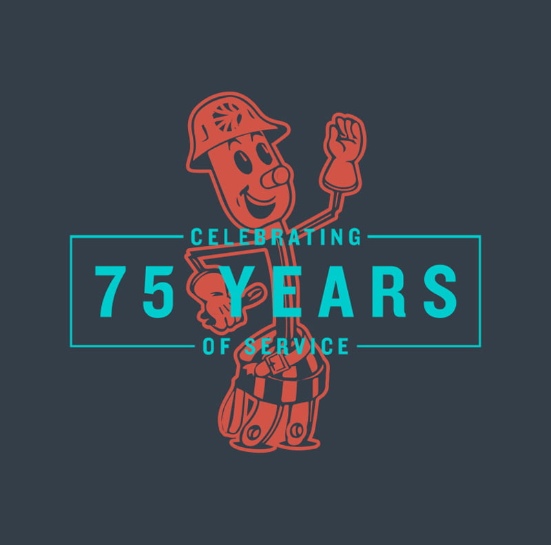
With 80 years of history, our approach has always been to honor the MidSouth past, while bringing a fresh, bold approach to all forms of digital and print communication. When possible, we’ve leaned into subtle evolutions instead of complete redesigns.
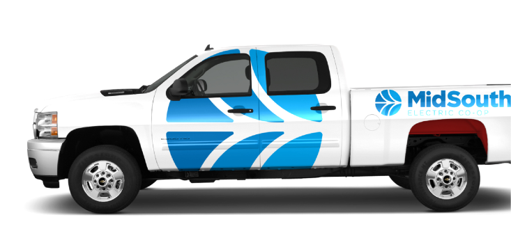
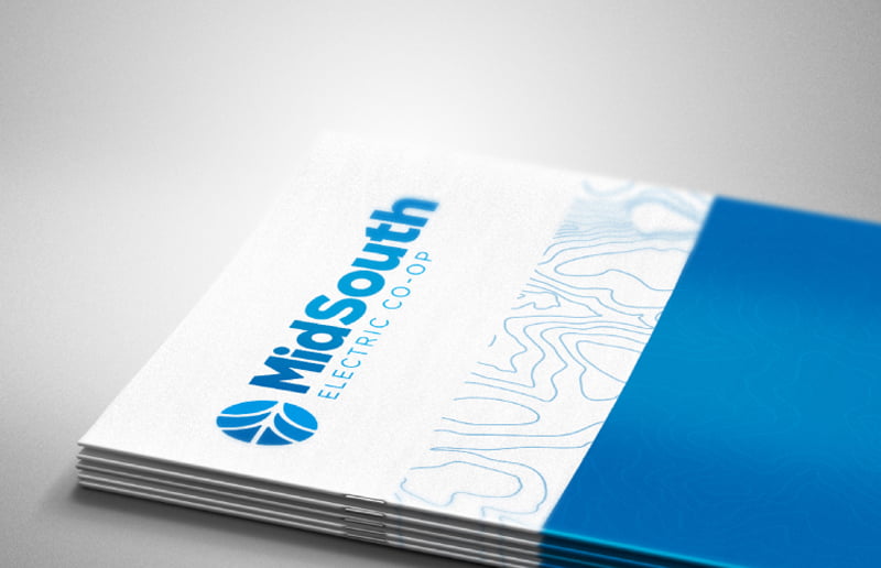
Deliverables
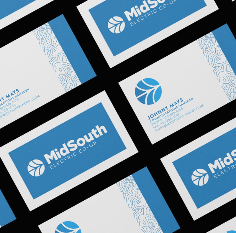
Corporate Rebrand
Messaging
Video Campaigns
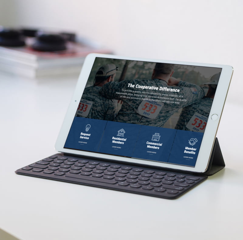
Custom WordPress Website
Visual Brand Systems
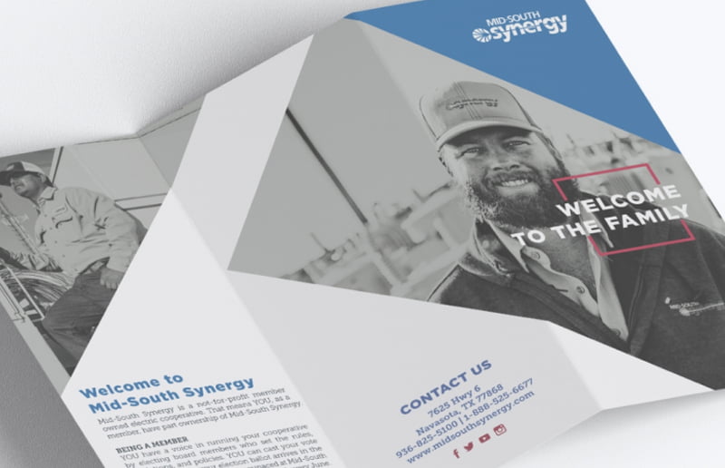
Print Design
Digital Marketing
Logo Design
Social Media Consulting
Copywriting
The Logo
The new identity is vibrant, fresh and modern while still paying homage to the original, very well recognized logo.
Before
After

Beyond an Electric Co-Op
The MidSouth brand has multiple sub-brands, a reflection of their progressive efforts, and within each sub-brand we created color variations, as well as patterns that reflect each of the branches. The icon has three subtle changes in color, which reflects the multi-layered services offered, and can change to reflect each sub-brand palette.


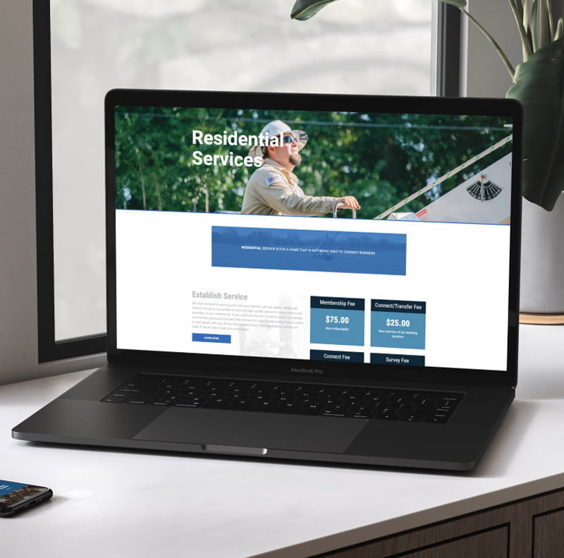
The new website made information easier to find. The result? Less calls to the office & More happy customers.


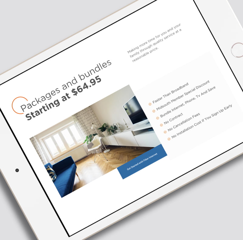
In 2021, MidSouth made a big investment and added fiber internet as a service to their territories. We used the brand system to develop an identity for Fiber, as well as build a marketing website for the sub-brand. We also ran paid social and crushed their sign-up goals early on.


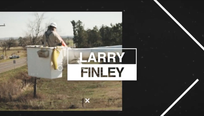
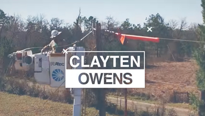
Storms take out power lines. And when the power is down, customers are unhappy. We created a social video campaign to connect customers to the linemen. The campaign videos helped create opportunities for empathy, and a more personalized understanding. Results? Less negative reviews, more positive social feedback.