September 15, 2026
Moist Favorite Creative Agencies Part 10: Helms Workshop
5 min read
Making Brands Feel Like Themselves
Some branding agencies have a recognizable aesthetic that follows them from project to project. Helms Workshop feels a little different.
Based in Austin, Texas, Helms is a full-service branding agency that works across identity, packaging, illustration, and advertising. Their projects can look completely different from one another, but they all feel incredibly specific to the brand they were created for.
That might be the thing Helms does best: finding the personality of a brand and giving it a visual language that feels completely its own.


99 is Better Than 12
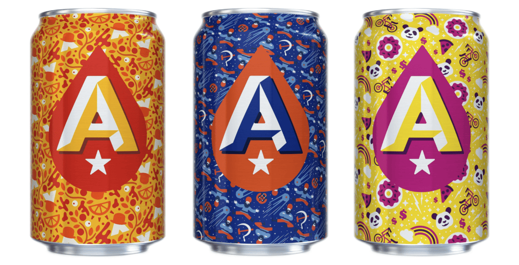
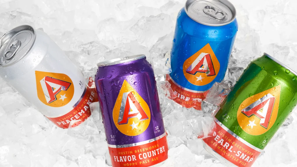
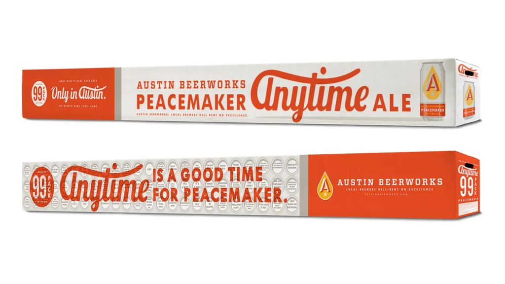
Their work for Austin Beerworks is a great example.
The brand already has a strong visual identity, with packaging that is simple, recognizable, and easy to spot on a crowded shelf. Helms takes that foundation and knows when to push it further.
The Peacemaker 99-pack is a particularly memorable example. The oversized package turns a familiar beer into something that feels like an event. It is still unmistakably Austin Beerworks, but the scale and execution give the brand an entirely new way to show up in the world.
That is what good packaging can do. It doesn’t just hold the product. It becomes part of the brand experience.
A Simple Idea, Done Really Well
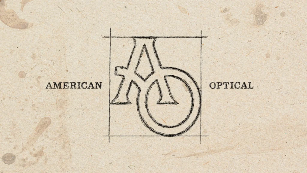
AO Eyewear takes a much more minimal approach.
The logo incorporates a pair of glasses into the letter O, creating a visual connection to the product without overcomplicating the mark.
It is a small idea, but an effective one. The kind of design that feels obvious once it exists, even though someone had to think of it in the first place.
Helms has a knack for finding those little opportunities within an identity—the kind of detail that makes a logo stick in your head without calling too much attention to itself.


Let the Illustrations Do Some Heavy Lifting
The same thinking shows up in Helms’ illustration work for Big Rock.
The brand uses a series of block-print illustrations, including a two-headed eagle, to create a visual language that feels much larger than a logo.
The illustrations give Big Rock something a logo alone couldn’t. They create a visual language that feels ownable, recognizable, and a little unexpected.
And that idea of building a whole world around a brand shows up throughout Helms’ work.


A Little Texas, A Lot of Lifestyle
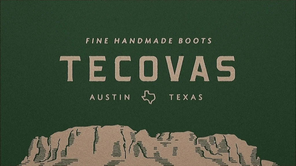
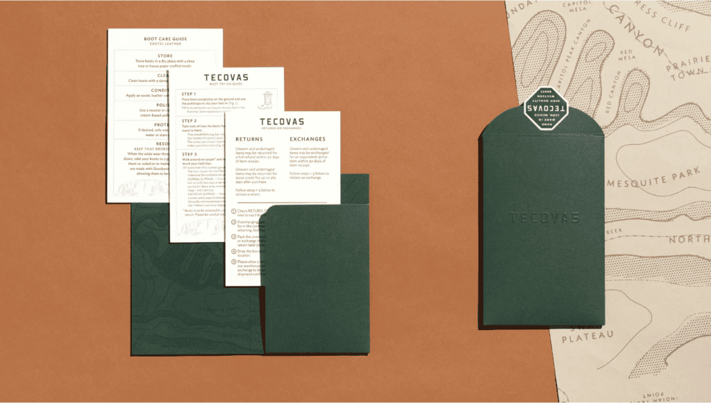
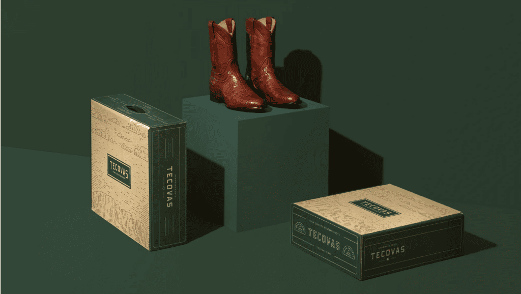
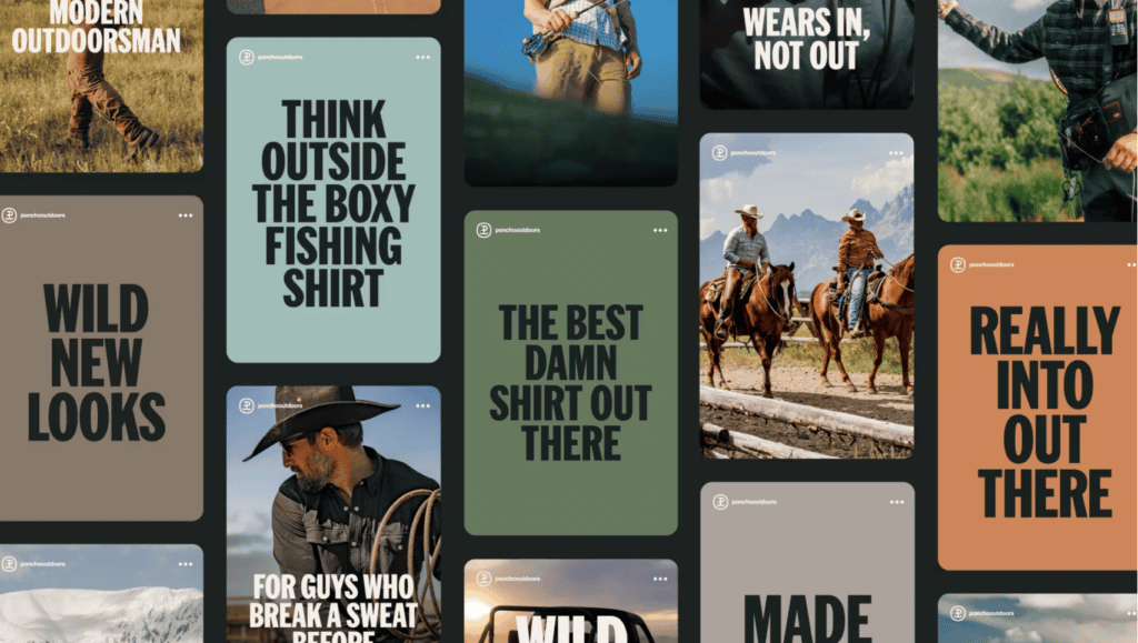
That ability to build a whole world around a brand comes through in Helms’ work for Tecovas and Poncho, too.
Tecovas isn’t just selling boots. The brand is selling a particular idea of Western life—craftsmanship, quality, and a certain kind of understated confidence. Helms carries that feeling through the identity and all the little details that surround the product.
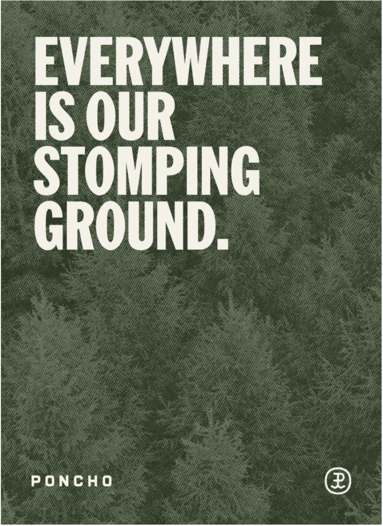
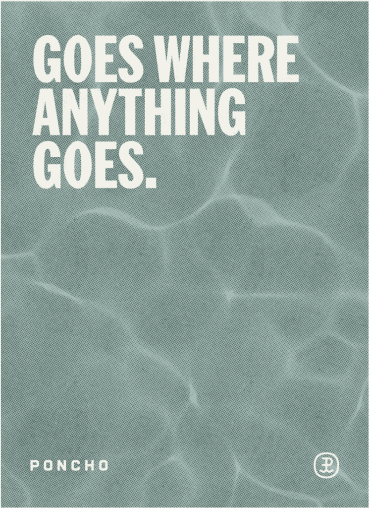
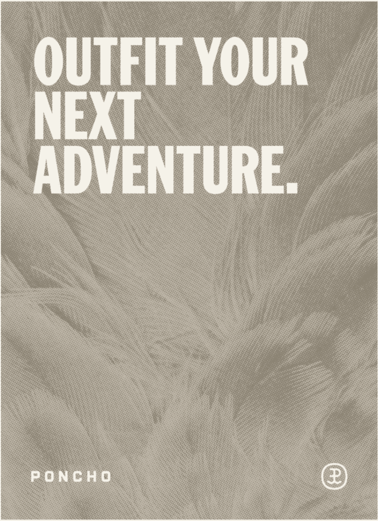
Poncho takes a completely different path. The brand feels rooted in the outdoors, but not in the overly rugged, tactical version of it. There’s a lifestyle built into the identity—one that feels adventurous, modern, and genuinely enjoyable to be part of.
That’s one of the things Helms does really well. They don’t just make a brand look good. They figure out what kind of world the brand belongs in, then give people a reason to want to step into it.

So, Why is Helms Workshop a Moist Favorite?
Helms Workshop describes its work as helping clients “put a dent in the universe.”
It is an ambitious way to describe branding, but looking across their work, it starts to make sense.
Austin Beerworks gets packaging that demands attention. AO Eyewear gets a logo that makes you look twice. Big Rock gets an entire illustration language. Haller Bros. and Tacos each get identities with their own sense of place, craft, and personality.
None of these projects look like the others, and that’s exactly the point.
Helms doesn’t seem to have a house style so much as a way of finding the style that belongs to each brand.
Every brand gets its own world and Helms knows how to build it.
Check ’em out: https://helmsworkshop.com/
Watch the full video here: https://youtube.com/shorts/ZElrGc5eKjU
Spread the love