


October 14, 2026
Moist Favorite Creative Designers Part 4: Jon Contino
3 min read
Bad Medicine, Brilliant Branding
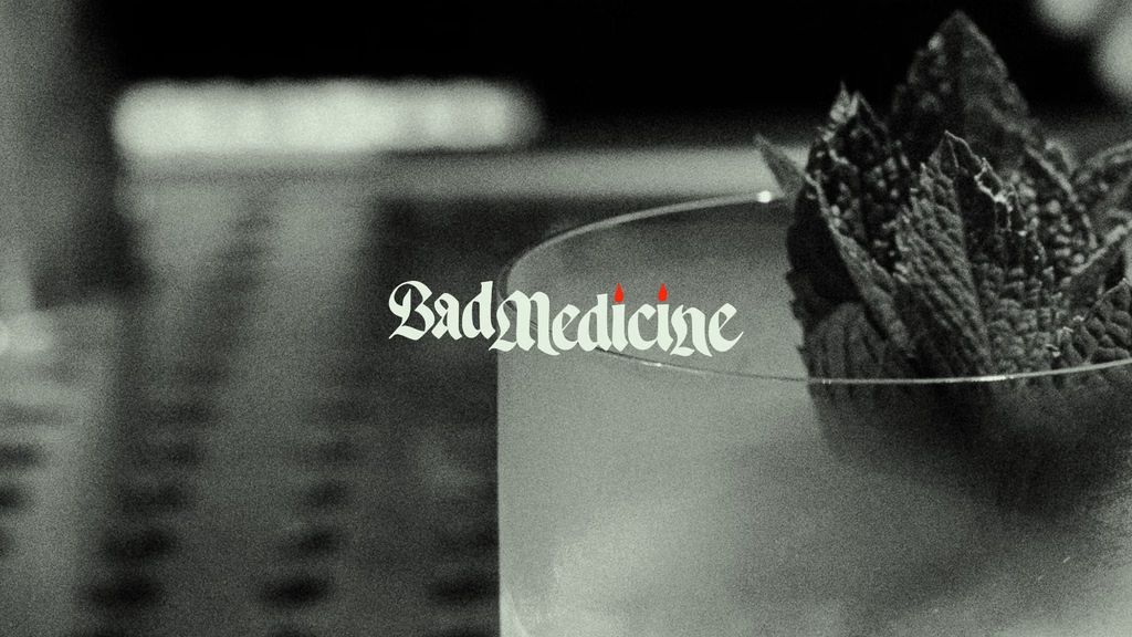
Some branding projects just have a certain feeling to them, and Jon Contino’s work for Bad Medicine is a perfect example. The brand leans hard into haunted, occult-inspired imagery, with a Temple of Spirits mark that’s impossible not to love. The gothic lettering has all the right notes, and that little mischievous demon character is the kind of detail that makes the whole identity even better.
Contino helped bring this world to life through branding that feels a little scary and a whole lot badass. There’s plenty of dark imagery to work with, but what makes the project so memorable is the personality behind it. Every element feels like it belongs, creating an identity that knows exactly what it is.



Blood, Sweat, and Handmade Letters
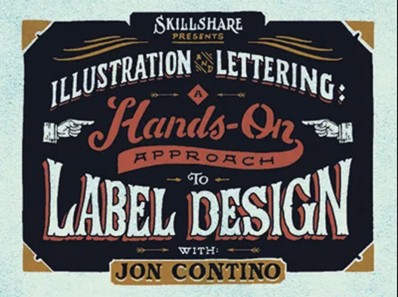
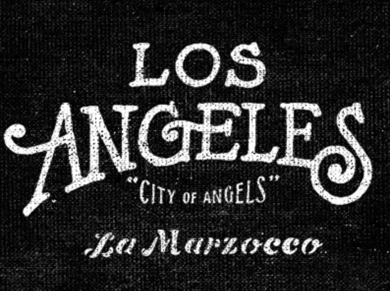
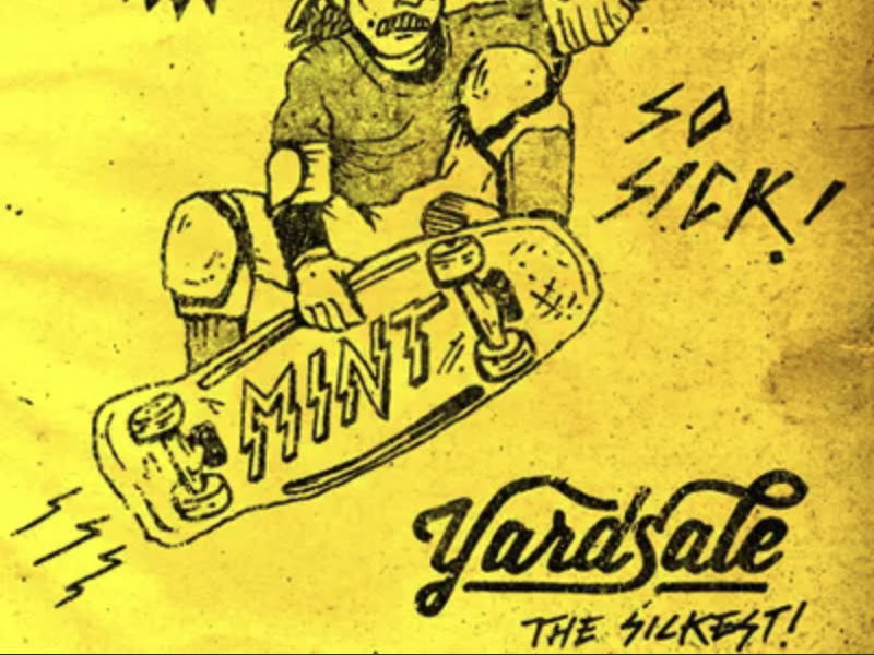
Contino’s work has evolved quite a bit over the years. His earlier style was packed with grit, texture, and handmade lettering, with illustrations that felt like they came straight from the sketchbook. It was the kind of work that made you wonder if he even owned a keyboard and mouse.
But the appeal went beyond the rough edges. Contino has always had a knack for finding the right solution to a design challenge and making it look incredible in the process. The texture and hand-drawn details weren’t just there for decoration; they were part of what made each piece feel right.
Today, that same character is still there, but the work has become more refined and timeless. The grit hasn’t disappeared so much as matured, giving way to a style that feels considered without losing its handmade charm.



A Decade of Lettering That Just Works
After following Contino’s work for around ten years, one thing becomes especially clear: few designers have such a strong feel for the nuances of lettering. He understands the nostalgia, history, and tiny details that give letterforms their personality, bringing those influences into work that feels distinctly his own.
It’s a tricky balance to strike. Lettering can have all the right references and still fall flat, but Contino knows how to make it feel alive. Whether it’s the intricate gothic details in Bad Medicine or the raw, textured lettering of his earlier work, there’s an instinct behind his decisions that makes the finished product feel effortless.
And apparently, the man has a great accent, too. We haven’t met him, but after a decade of following his work, we’re happy to take the word of anyone who’s heard him on a podcast.


More favorite creative designers on the way.
Check ’em out: https://continonewyork.com/
Watch the full video here: https://youtube.com/shorts/rdjbbPP4Te8
Spread the love


