


September 22, 2026
Moist Favorite Creative Designers Part 1: Adam Vicarel
4 min read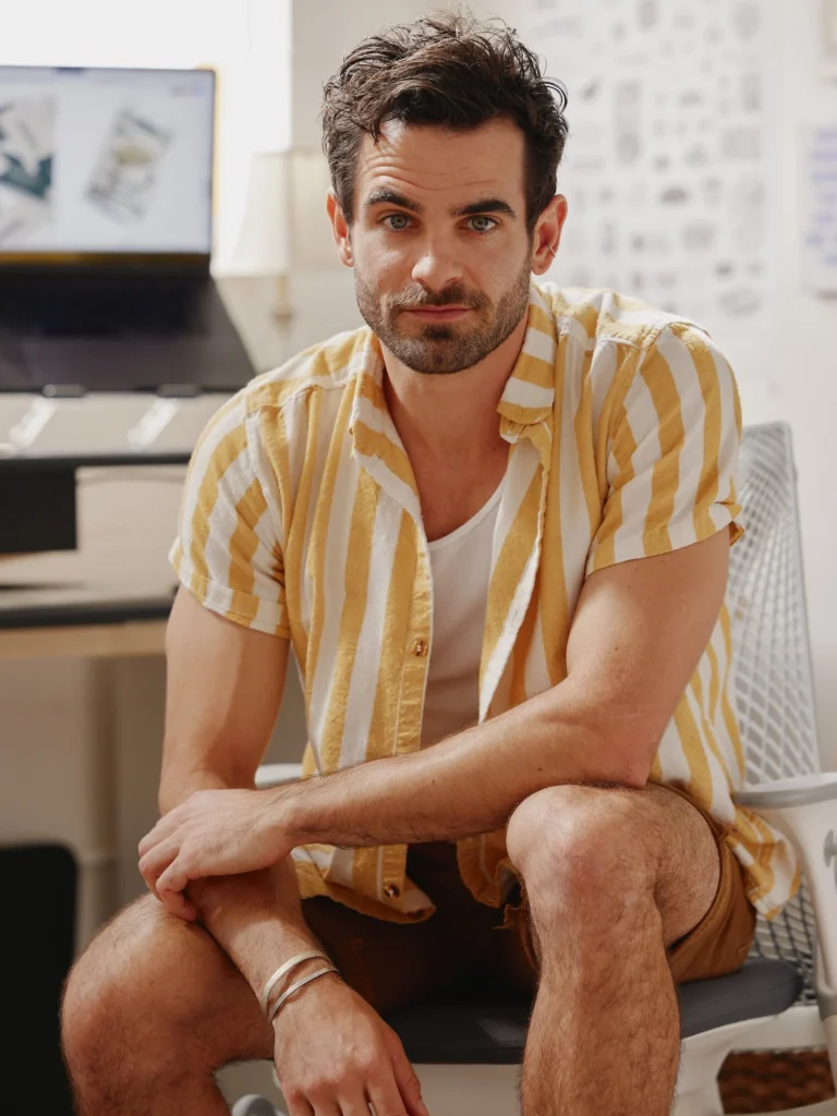
Some designers make you wonder how they do it.
We want to start a new series highlighting some of my favorite designers—the individuals grinding away and making some of the coolest stuff out there. Adam Vicarel is exactly the kind of designer this series was made for.
The guy is ridiculously talented. Honestly, it’s almost a little irritating. You look at his work and think, Okay, cool. So apparently you can just do everything.
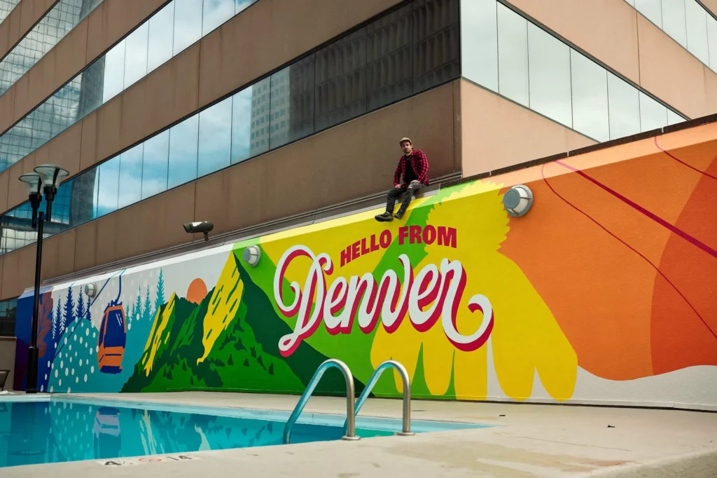
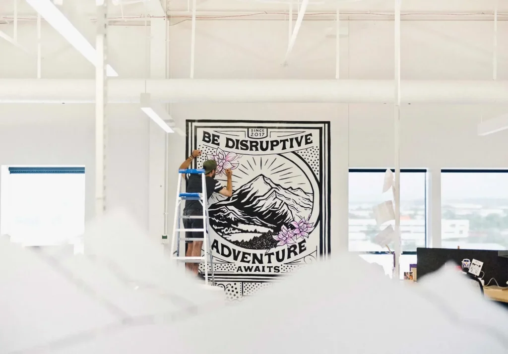
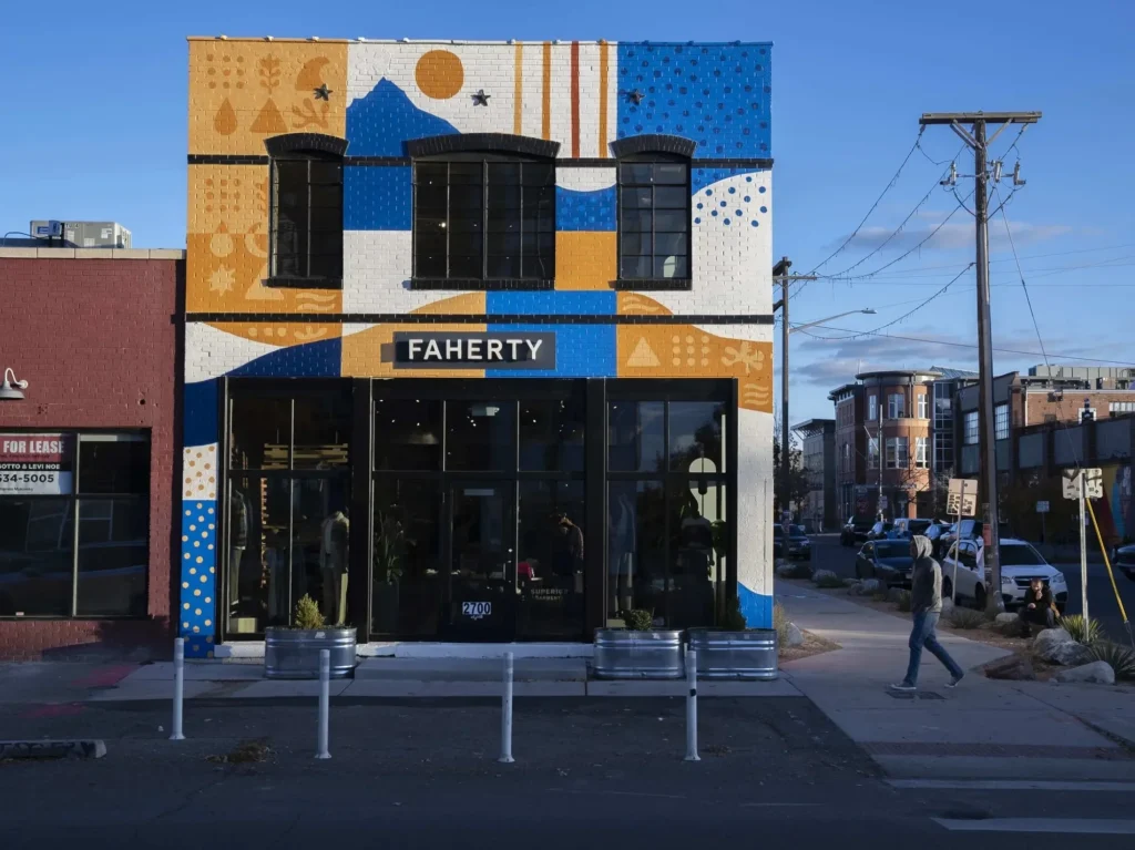
Lettering. Illustration. Murals. Typefaces. Branding. Hand-painted objects. Weird little creatures. Somehow, he seems to have an endless supply of creative tricks up his sleeve.
And yet, it all still feels unmistakably like him.
The Adam Vicarel Fingerprint
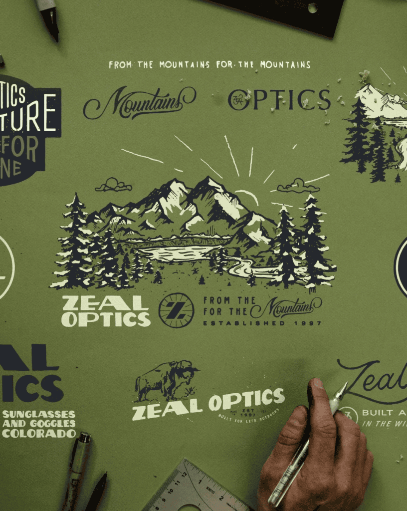
The first thing that jumps out in Vicarel’s work is the texture.
His lettering feels made rather than manufactured. Rough edges, unexpected shapes, decorative flourishes, chunky forms, and little imperfections give everything a pulse. Even when he’s working digitally, the work retains that feeling of something a person actually sat down and made.
Beyond the lettering, Vicarel has an arsenal of typefaces, too. You’ve probably seen Whiskey Joint before, but his typefaces aren’t just a collection of different styles. Instead, they all carry that same Vicarel sensibility—gritty, expressive, textured, and unapologetically handmade.
That consistency is what makes his work so recognizable.


From Murals to YETI Mugs
Of course, Vicarel isn’t just a lettering guy.
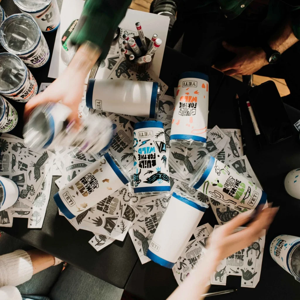
His work stretches into murals, illustration, and all kinds of physical applications. He’s painted massive murals, while also bringing that same hand-drawn energy to much smaller canvases. One example is a series of YETI mugs featuring fantastic one-eyed creatures, all hand-drawn directly onto the mugs.
There’s something really fun about seeing that style translated onto objects you can actually hold. At the same time, the illustrations feel loose and playful without ever feeling careless.
That’s a pretty difficult balance to hit.



When Illustration Actually Solves Something
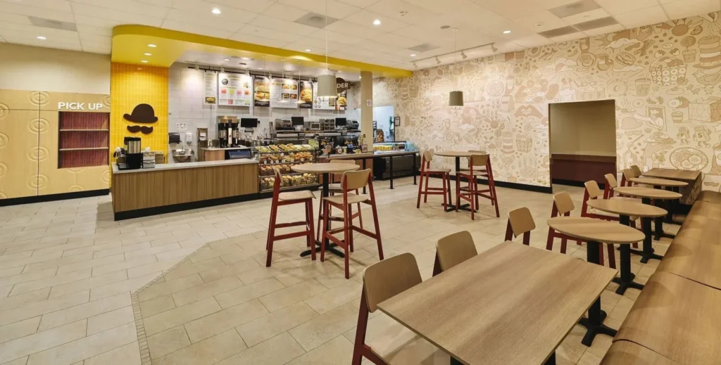
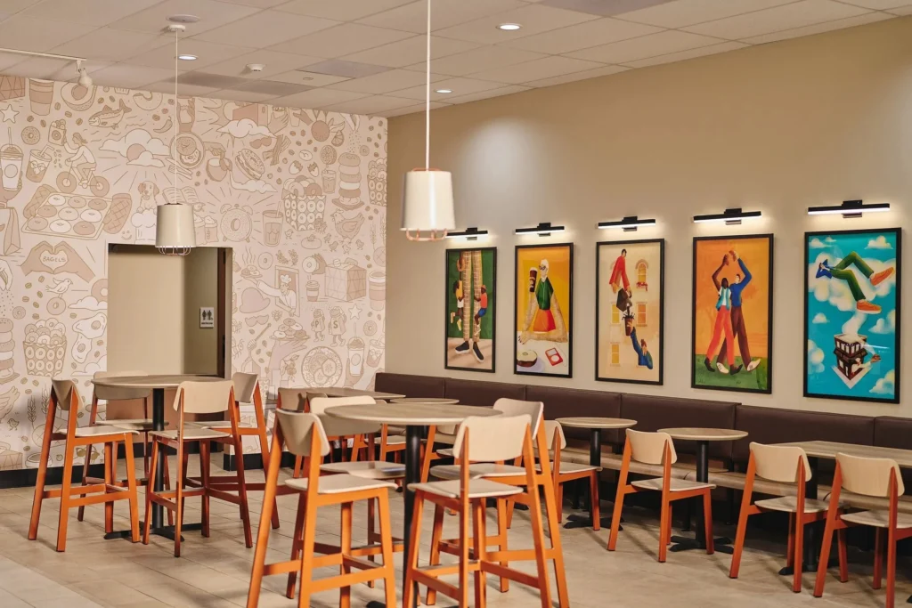
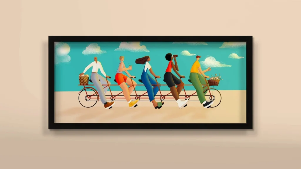
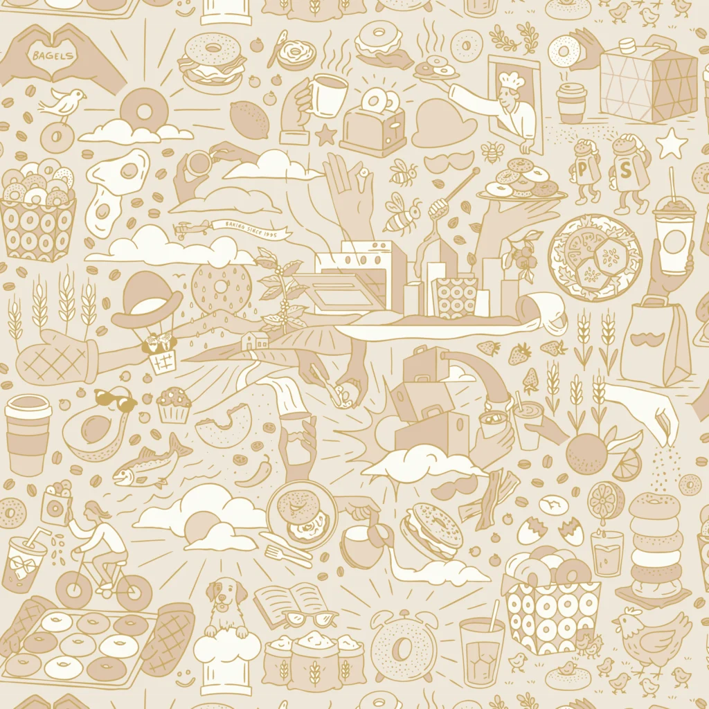
One of our favorite examples of his illustration work is what he did for Einstein Bros.
The illustrations aren’t simply there to make something look pretty. They actually serve a purpose within the brand and help solve a visual communication problem.
Whatever the problem was, it’s solved now.
And honestly, that’s the kind of design work we love. Something can be beautiful and weird and fun, but it still has a job to do. The best designers figure out how to make those things happen at the same time.


Human, Messy, and Very Good
That’s probably what we like most about Vicarel’s work.
It’s incredibly designed without feeling overly designed.
His lettering and illustrations have personality. They have quirks, texture, and a sense of humanity. More importantly, they feel like they came from somebody’s hands instead of being assembled by committee. That quality is especially apparent in his typography. The decorative flourishes, ligatures, badges, and little details give you something new to look at every time. There’s just a ridiculous amount of visual candy packed into the work.
It’s the kind of stuff that makes your eyes happy.
Ultimately, Adam Vicarel is a hardworking design beast, and he has a knack for smashing humanity into lettering and illustration in a way that feels completely his own.
Consider us enamored.
And this is just the beginning. There are plenty more designers worth obsessing over.
Check ’em out: https://www.adamvicarel.com/
Watch the full video here: https://youtube.com/shorts/cWt0MPPxMnc
Spread the love

