


September 23, 2026
Moist Favorite Creative Designers Part 2: Tad & Jessica Carpenter
4 min readThe Design Deities from Kansas City
For the second installment of Moist Favorite Creative Designers, we’re heading to Kansas City to talk about a duo who have an almost unreasonable amount of kick ass work under their belts: Tad and Jessica Carpenter.
Together, the Carpenters have built a body of work that feels playful, thoughtful, and unmistakably their own. Their work spans branding, illustration, lettering, publishing, and plenty of places in between. They’re the kind of designers who make you want to immediately open up your sketchbook and start making stuff.
And honestly? They’re kind of design deities.


An Onion, a Rooster, and a Whole Lot of Geometry
One of our favorite examples of their work is the branding for The Brass Onion.
At first glance, the concept sounds simple enough: it’s an onion. Except it’s also a rooster. And it’s wrapped up in mid-century geometry.
That combination is what makes it so good.
The Carpenters have a knack for taking things that don’t naturally belong together and finding the visual language that makes them feel like they were always meant to coexist. The Brass Onion identity does exactly that, turning an onion, a bird, and a bunch of geometric shapes into something that feels cohesive, memorable, and ridiculously fun.
When a single visual idea is strong enough to carry an entire identity system, you know you’ve got something special.
The whole thing is an onion and it’ll bring a tear to your eye.


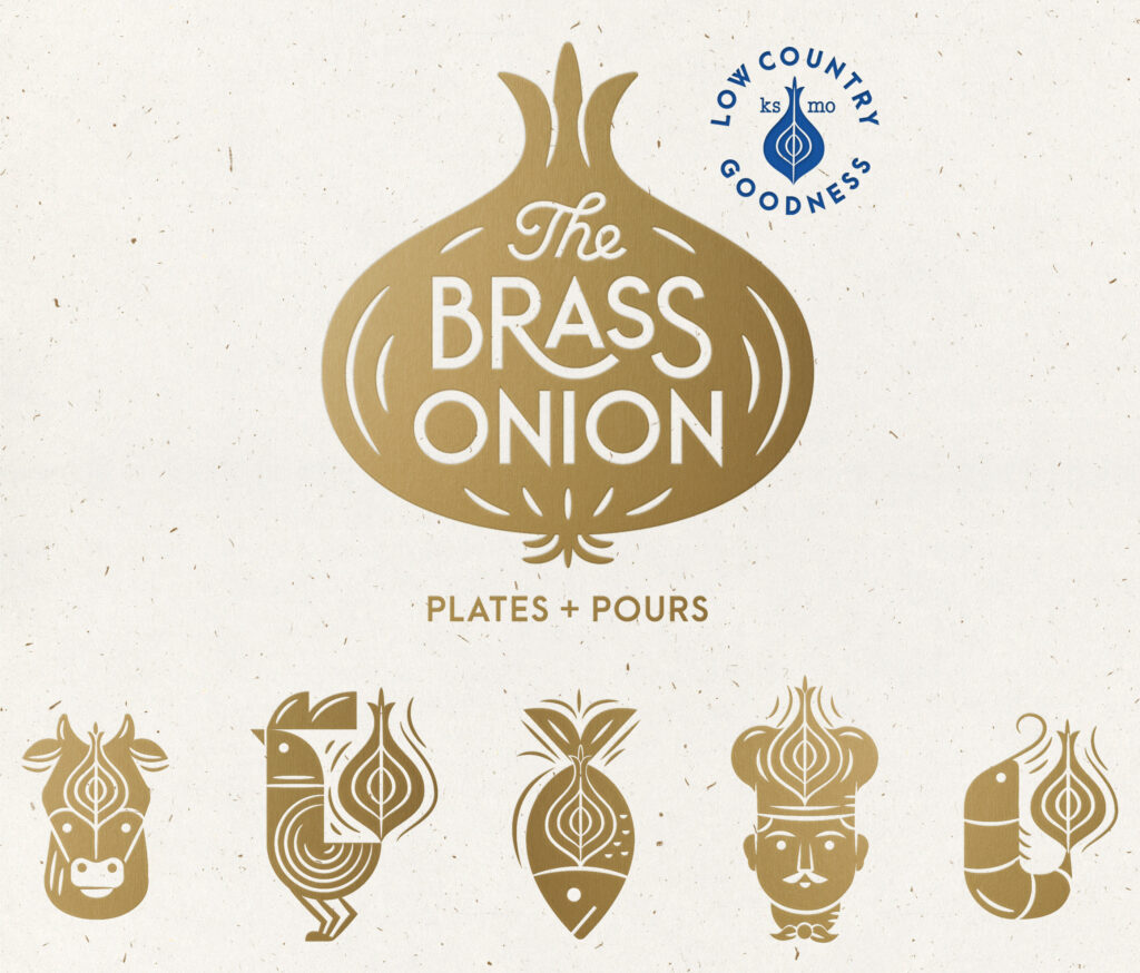
Birds, Circles, and Everything in Between
If there’s a recurring visual language in the Carpenters’ work, it’s hard to miss the love for birds and circles.
There are birds that are circles. Circles that become characters. Characters built out of simple geometric forms. Somehow, all of these seemingly basic shapes become expressive little worlds.
That’s part of what makes their work so recognizable. The shapes are simple, but the ideas built from them aren’t.
Their client list reflects that range, too, with work for major brands and organizations that know the value of thoughtful, beautifully crafted design. But even as the scale of the clients changes, the work still feels personal and playful.


The Kind of Books You Want to Climb Into
The Carpenters have also illustrated dozens of books, and this might be where their ability to create entire little worlds really shines.
Their characters and environments are full of exaggerated forms, playful lettering, geometric shapes, and tiny details that make you want to spend more time looking around.
There’s something wonderfully nostalgic about it all. It feels like childhood, but with really good art direction.
The characters are weird in the best way. The environments feel like places you could actually wander around in. The lettering becomes part of the personality instead of simply labeling what’s happening.
It’s easy to look at these illustrations and think, I want to jump into this page and hang out here.


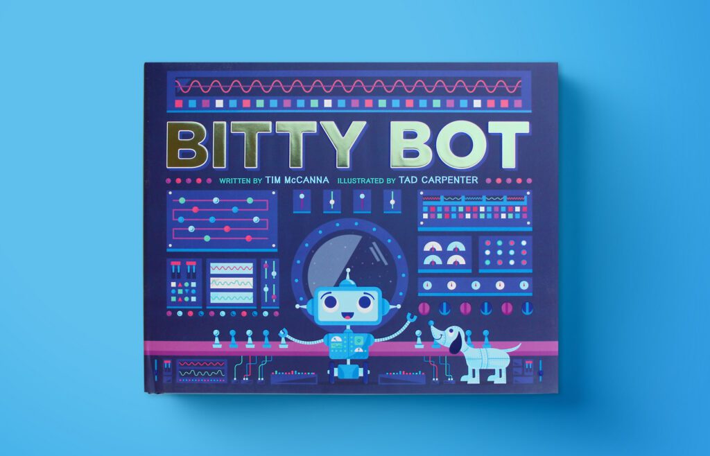

Make More. Find Yourself.
Tad Carpenter has said, “Through making, you find yourself.”
That idea feels particularly fitting when looking at the Carpenters’ work.
The more they make, the more clearly their visual language comes through. You can see the shapes, characters, colors, lettering, humor, and craftsmanship building on one another across projects.
They’ve simply made a lot.
And maybe that’s part of the lesson hiding underneath all the fun: sometimes the best way to figure out who you are creatively is to keep making things until you start recognizing yourself in the work.
Tad and Jessica Carpenter have certainly done that. At this point, they know themselves at a molecular level.
Basically, they are design deities.
Check ‘em out: https://carpentercollective.com/about/
Watch the full video here: https://youtube.com/shorts/shO8YB7Cl2M
Spread the love

