



September 14, 2026
Moist Favorite Creative Agencies Part 9: Smith & Diction
4 min read
Branding With a Little More Energy
Some branding projects are cool. Some are clever. And then there are the projects that make you think, Okay, how the hell did they come up with that?
That’s the kind of work that caught our attention with Smith & Diction.
The Philadelphia-based branding and design agency has a portfolio full of identities that feel thoughtful, expressive, and anything but predictable. And lately, they may have gotten the ultimate creative playground: a rocket company called Cowboy Space Corp.
Yeah. A rocket company called Cowboy Space.
And somehow, the branding is even better than the name.
Cowboy Space Is Out of This World
Let’s start with the obvious one.
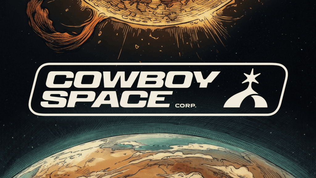
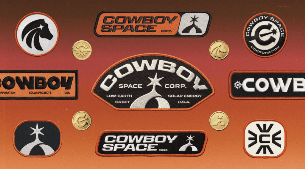
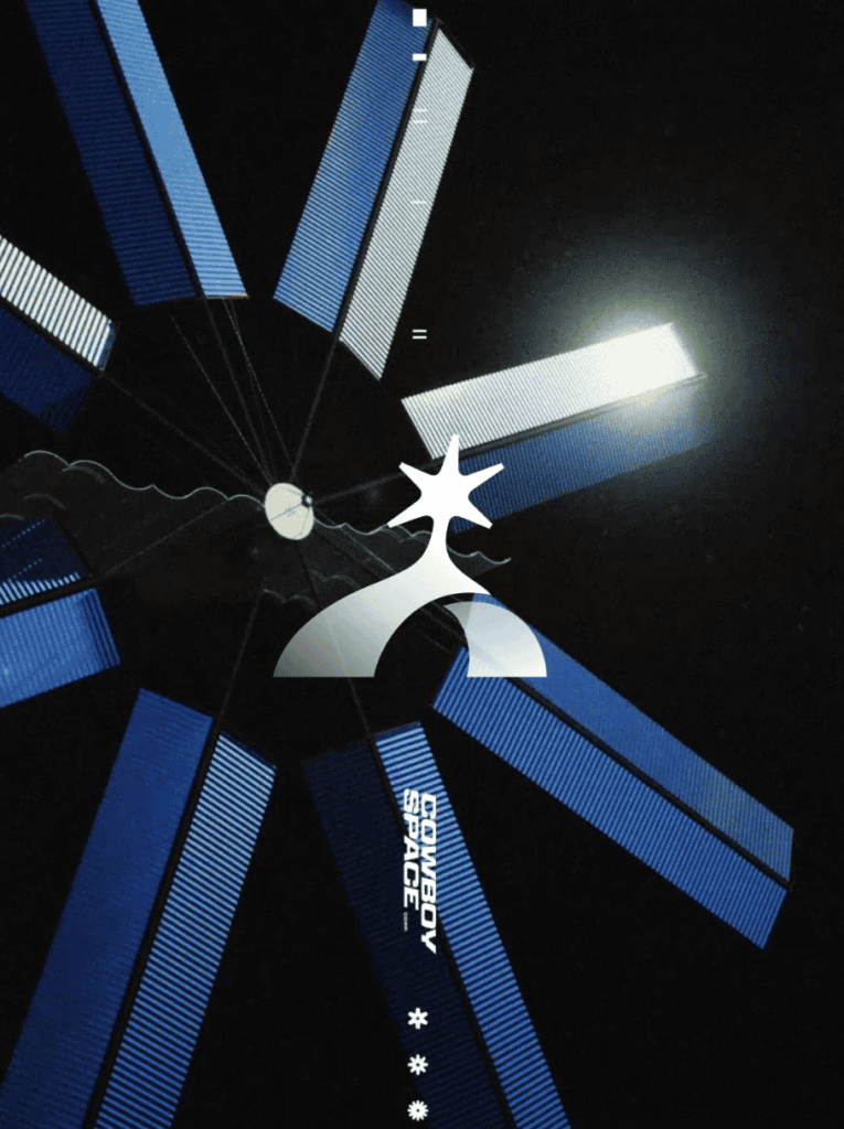
The Cowboy Space Corp. identity takes a few very different ideas—spurs, horizons, and rocket launches—and turns them into one incredibly simple mark. It feels like the Wild West and outer space somehow decided to become best friends.
And then there’s the typography.
Instead of playing it safe, Smith & Diction brought in four supporting typefaces, somehow managing to make all of them work together without the identity feeling chaotic.
That’s one of the things we love about their work. They’re willing to push an idea pretty far, but there’s always enough structure underneath it to keep everything feeling intentional.


Logos That Have More Than One Trick
A lot of Smith & Diction’s logos are doing more than just looking good.
They’re built around ideas. They can tell a story, shift depending on where they’re being used, or come to life through motion. The identity isn’t necessarily finished once the logo is drawn.
Their work for Perplexity is a great example of this.
On its own, the mark is simple and distinctive. But once it’s animated, you get to see another side of the identity. The logo becomes something that can move, react, and live within a digital environment.
That flexibility is a big part of what makes their work so interesting.


Sometimes Four Logos Are Better Than One
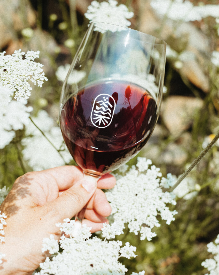
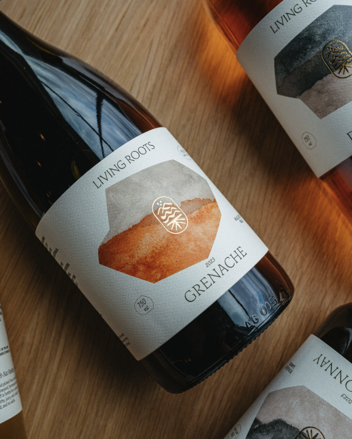
But the project we keep coming back to is Living Roots, a winery.
Normally, if you’re trying to combine several ideas into one logo, you’d probably try to cram everything into a single symbol. Take a little bit of this, a little bit of that, and Frankenstein them together until you have one complicated mark.
Smith & Diction basically said, Nope.
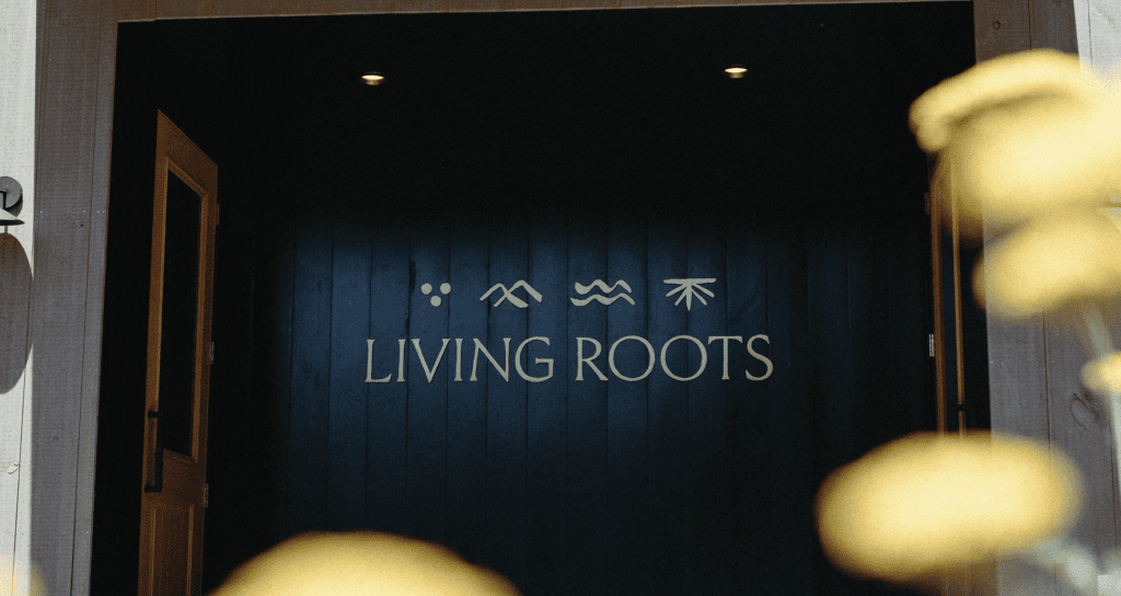
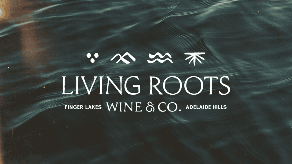
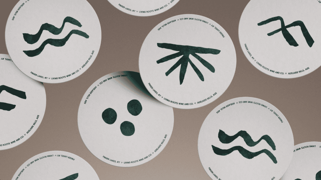
Instead, they created four tiny logos and stacked them together.
Each one represents a different part of the brand, and when they’re combined, they tell a bigger story. It’s a simple idea, but it shows how much more interesting an identity can become when you stop thinking of a logo as one static thing.

Energy Is the Fingerprint
If we had to pick one thing that connects Smith & Diction’s work, it would be energy.
Their identities feel like they’re meant to move. Animation isn’t treated like something you add at the end to make the brand feel more exciting. It’s part of the identity from the beginning.
That approach gives their work a different kind of life.
Even when you’re looking at something static, you can almost imagine how it could move, change, or interact with its surroundings.
And that’s a pretty great quality for a branding agency to have.
So, Why Is Smith & Diction a Moist Favorite?
Because they know how to make branding feel fun again.
Smith & Diction takes ideas that could easily become overly complicated and finds ways to turn them into identities that are expressive, flexible, and full of personality. Whether they’re branding a rocket company called Cowboy Space, bringing a tech brand to life through motion, or stacking four tiny logos together to tell the story of a winery, they keep finding unexpected ways to make the work work.
And honestly, we don’t know how you beat a rocket company called Cowboy Space Corp.
But if you’ve seen something better, we’re all ears.
More creative agencies on the way!
Check ’em out: https://smith-diction.com/
Watch the full video here: https://youtube.com/shorts/a3HmeLDnN2E
Spread the love

