
Since its inception in 2011, That Conference – a conference for software developers – has partnered with us for all branding, messaging, and graphic design needs.
Wisconsin & Texas
Software Developer Conference
Brand Strategy
Brand Messaging
Tagline Development
Conference Branding
Brand Videography
Conference Web Design
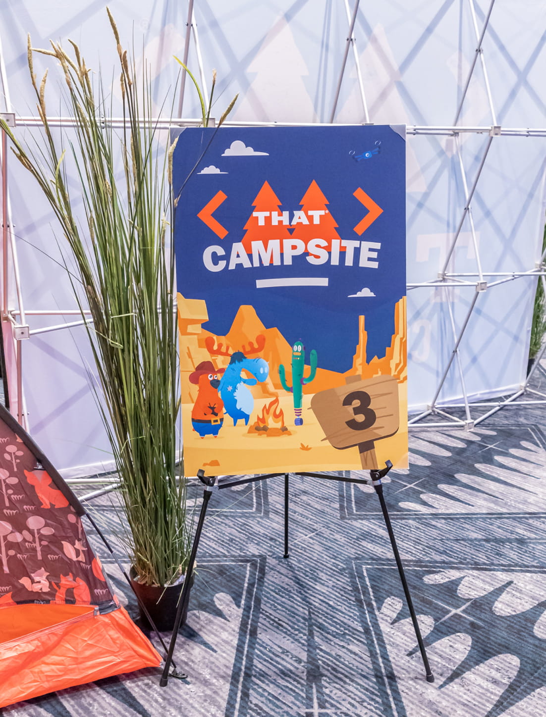
Environmental Graphics
Digital Marketing
Signage

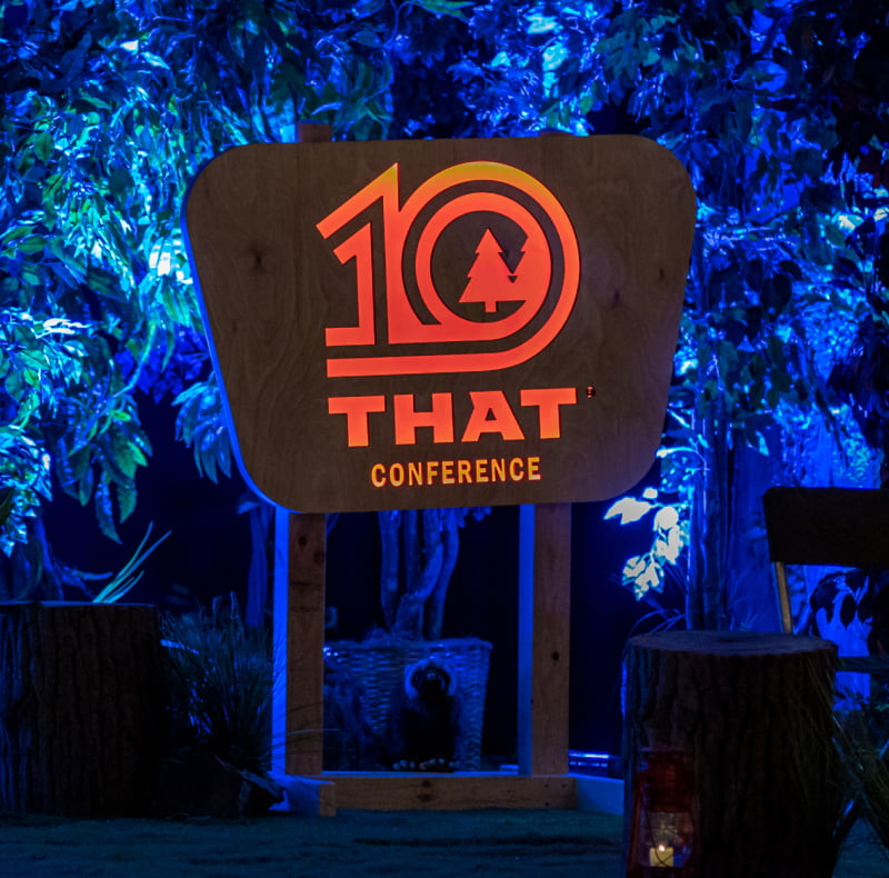
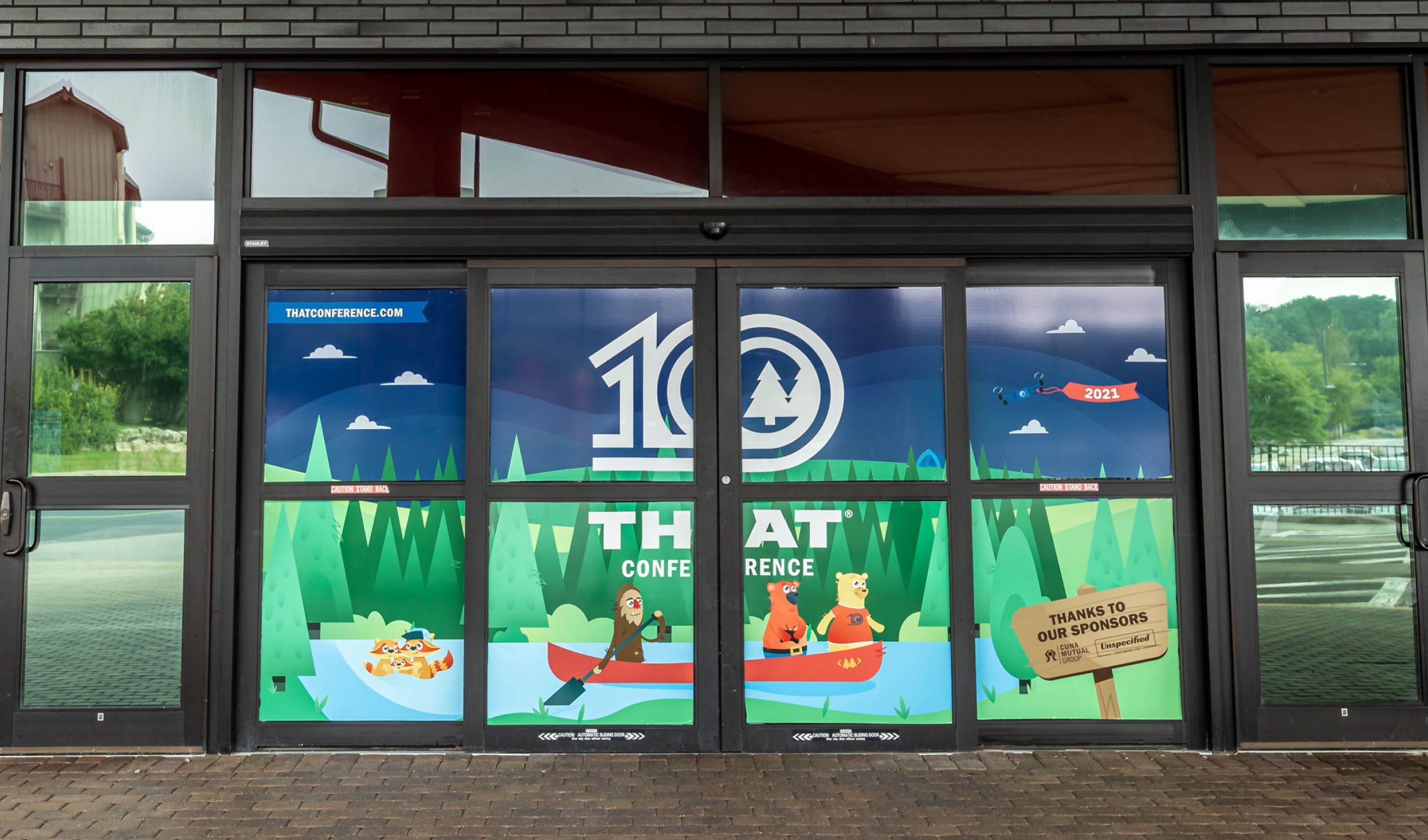
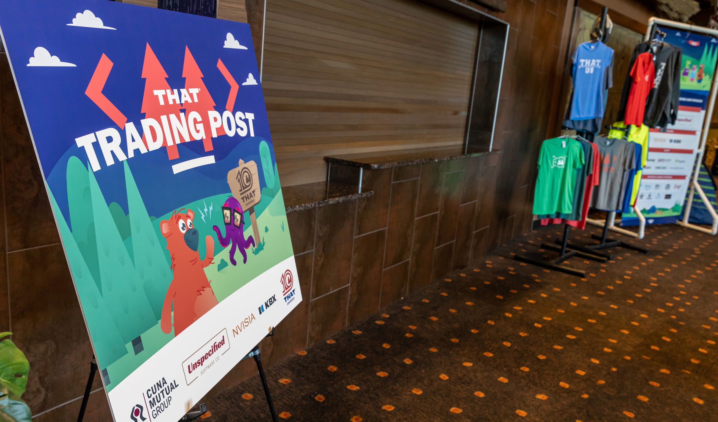
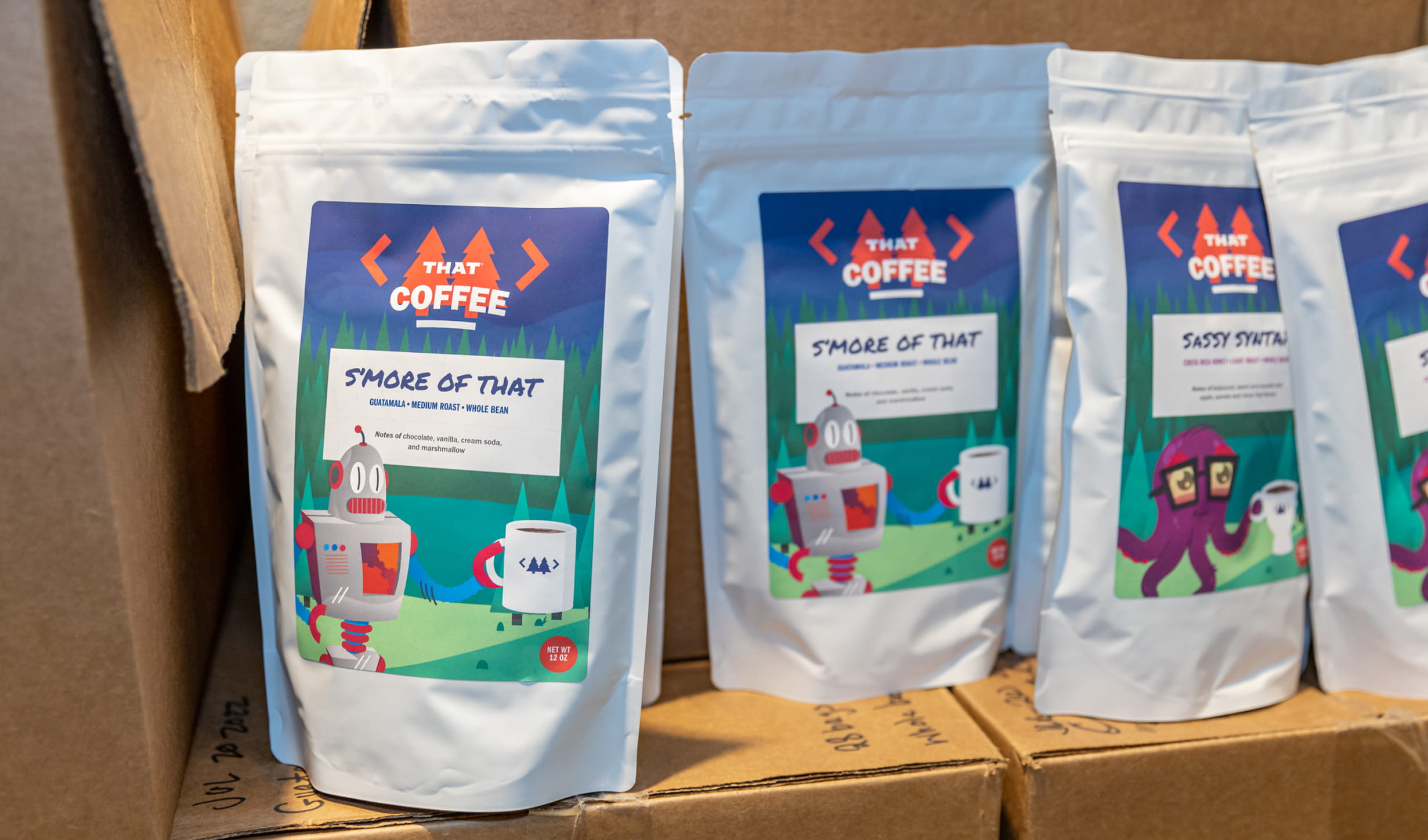
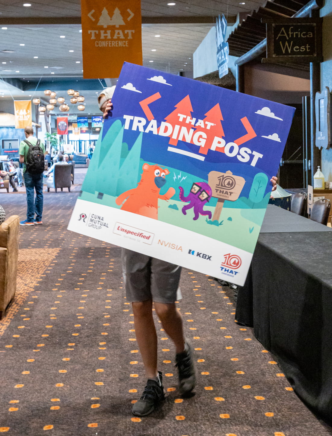
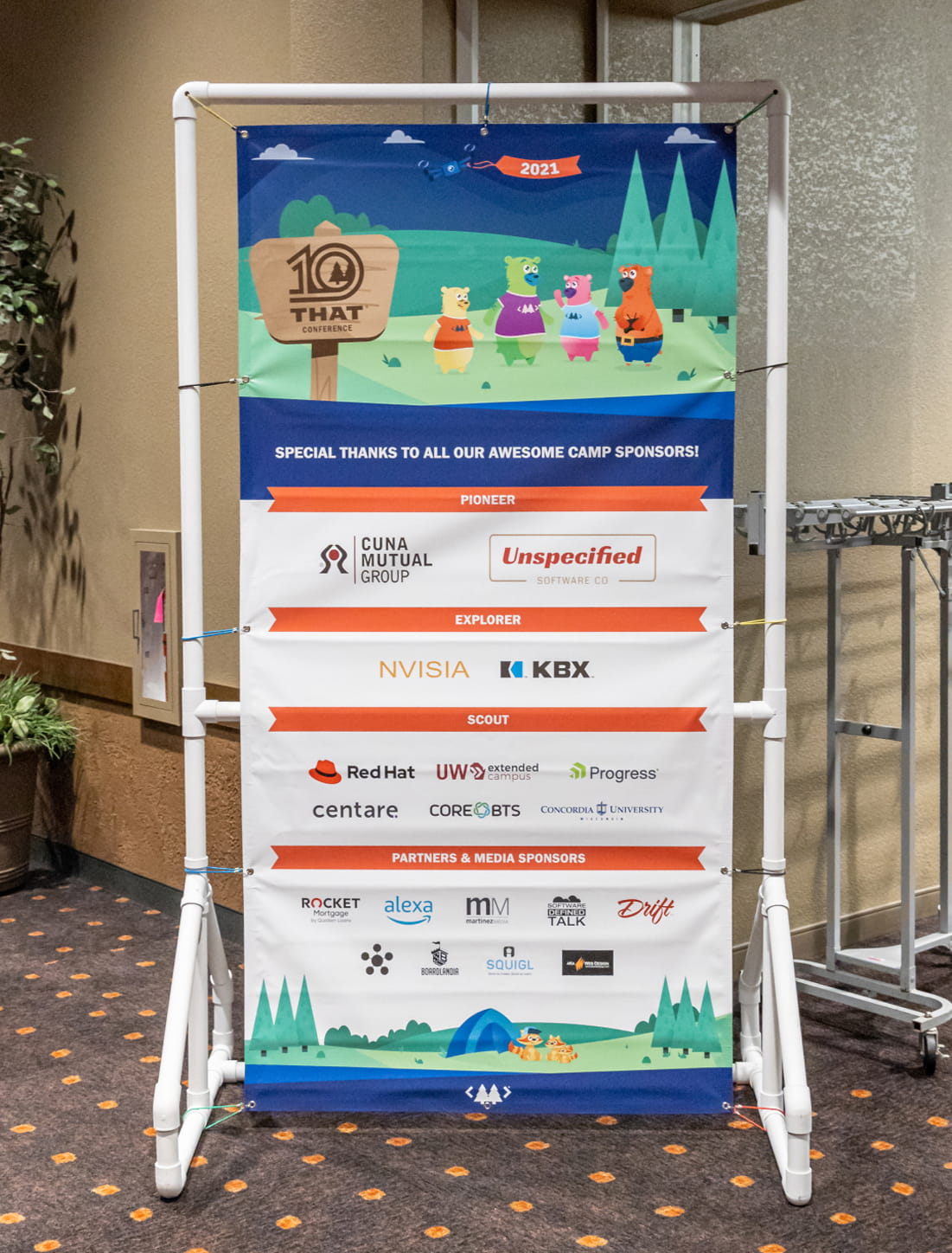
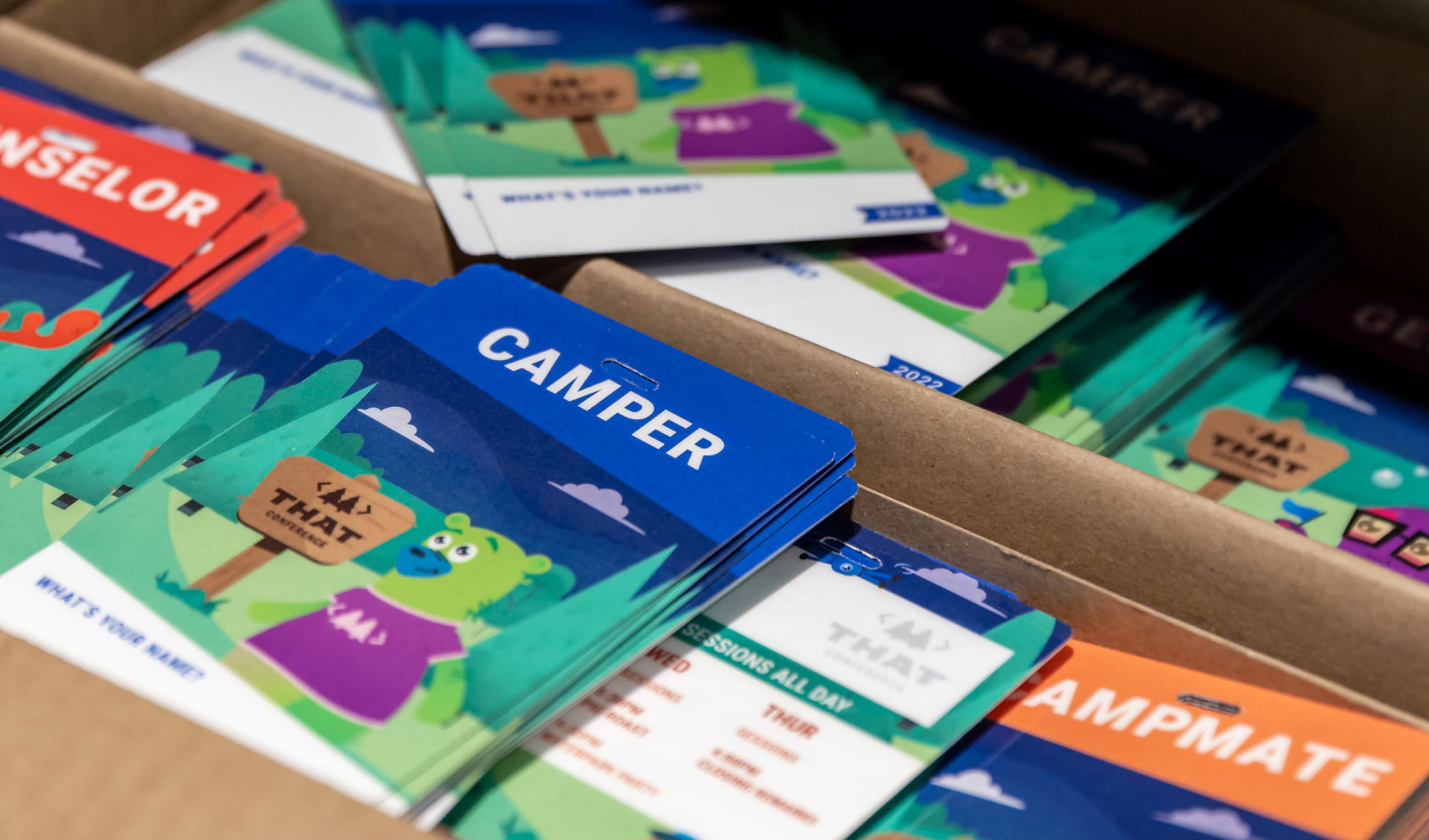
That Conference’s founder wasn’t looking to build anything “normal”. It needed to feel like a family reunion, summer camp, or friends hanging out. We made sure the branding and all the graphic design that goes into a 1700 person conference helped create an experience worthy of sharing over a campfire.
That Conference is located in Wisconsin Dells, WI and Austin, TX and it’s at a giant indoor water park. Incredible speakers and workshops are lined up between pig roasts, board game nights, and water park parties. Software developers from all over the U.S. celebrate and learn together. The spirit that we helped communicate has created an engaged, thoughtful, and geeky community.

Our defining role in developing the strategy, language, and visuals has helped shape the culture and personality of That Conference.
The culture and brand celebrates community, sharing, and family. And software developers love it.
That Conference is now hosted by the Kalahari in Austin, TX in the winter, and Wisconsin Dells, WI during the summer.

Leveraging the community-focused mission, we helped create a digital experience that helps campers connect, and extend the That Conference brand across 365 days. The UI/UX was built for conversion and conversation, with clear call to actions and plenty of quirky illustrations.


All year long it’s all he can talk about. “This one time at That Conference” is getting to be so old. We love ‘em, but it gets exhausting.


That Conference finished up and was a huge success and we finally got our hands on some images of the event courtesy of the That Conference staff. If you didn’t see our last post about it, go here. Below are some photos with our branding and design work in action.
A ton of people attended That Conference. Most of them were balding or bald.

The logo was used for some pretty rad things. This is a giant stamp.

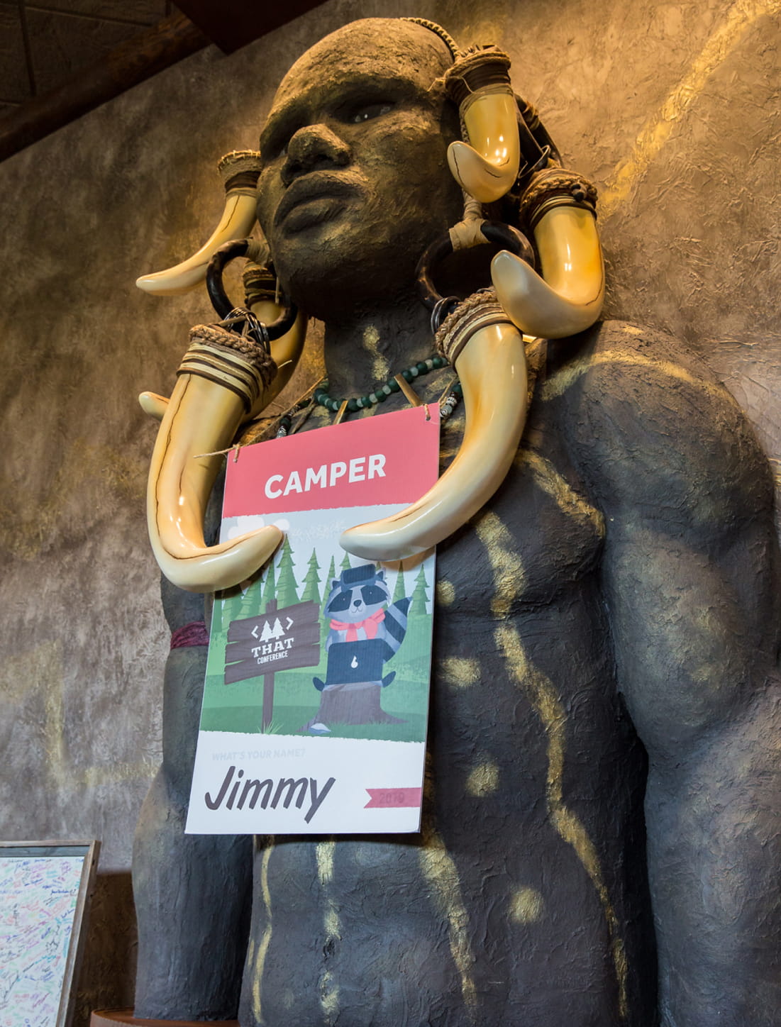
So much fun was had. Look at those smiles. They’re wearing cool shirts and badges that we designed.

Random guy rockin’ That Conference swag next to a sign. Yes!

This might be the most amazing use of a logo we’ve designed. That Conference had a big pig roast and the logo was branded onto some pig skin. This will be a hard one to top.

Cool dickies shirts for the camp counselors aka speakers/staff.

Tablet stands!

Stoked for 2013.
![]()
Sadly we were not able to attend That Conference which is going on right now at the Kalahari Resort in Wisconsin Dells, WI. However, we’re excited because twitter has been blowing up about it with tons of positive feedback and even some nods at the design work, which we were lucky enough to be a part of. There were so many details that went into this event and Clark Sell (the event organizer) gave us a ton of freedom which was awesome. We’re hoping to get pics of some of the actual printed pieces, like the badges, posters, etc, but for now here are some mock-ups. So if anyone that attended has pics, tweet them at us and we’ll add them to the post! Thanks!
Badge design:

Web Banner ads. You can see version 1 and version 2.

We did the design for the website which you can check out at thatconference.com but here’s a screen shot of it as well.

There was quite a bit of signage for the conference for different sessions, areas, events, etc.

Here’s a poster for the sponsors

We’re excited for That Conference 2013 and sharing more of the designs when we can!

Currently working on the branding, website and all kinds of fun marketing materials for That Conference. Just wanted to share a little bit! Much more to come.
The first phase of the website is moving along quite nicely. You can check it out here: thatconference.com
That Conference will be in August of 2012 at the Kalahari Resort, Wisconsin Dells, WI and will be a developer’s dream summer camp. It’s going to be pretty epic, so if you plan to attend one conference next year, make it one where you can learn about the geekiest stuff from top developers and then ride a giant water slide immediately after. Be sure to sign up on the site to stay up to date. Or follow them on twitter: @thatconference
I know the feeling. Clutching your portfolio tightly as you ride the elevator up to the top floor, wearing your favorite outfit, and only nervous – a lot. Wondering if all the hard work and late nighters you pulled was enough. Wondering if you put the right projects in your portfolio or if you should have left one out. I know the feeling, because I went through this exact process as a student at Sam Houston State University. I’ve had the great opportunity to attend the National Student Show and Conference as both a student and as a professional and it has been such a fun experience being on both sides. This is the fourth year i’ll be reviewing portfolios with Drifting Creatives (come say hi and let me know if you read this!) and i’ve picked up a few things over the years.
Not sure what the National Student Show and Conference in Dallas is? It’s a professionally judged creative competition and three-day conference built for graphic design students and their educators. Attendees come from all over the U.S.
Here are a few tips to help you prepare for the review and job fair and for when you’re finally at the conference; here we go!
Remember that you’re showcasing who you are as a designer. If you plan on coming in and pulling your portfolio up on your phone; you might want to stop and rethink that plan. Trust me, we can tell pretty quickly who put thought into their work and who sort of just threw it together. When thinking about how to show off your work remember that quality is also important. Portfolios in book form are great because we can flip through your projects with ease. If you decide to go this route, just remember that a bad print job can weaken your projects, no matter how amazing they are. Print on high quality paper and if there are photographs, double check that the print is clear and crisp. If you can’t see the details in the print, then neither can we. If you’re planning on bringing a digital portfolio, make sure you are able to navigate easily through your projects and that it is displayed on a screen that is big enough for both you and the reviewer to look at at the same time.
Detail is key when making decisions on how to showcase your work. Everything that you are showing should be enough to see the entire project without you having to explain it. Scale is also a huge factor when using mockups and taking photographs of your work. Try not to cram as many mockups as you can into one spread. Scale up and show off all the design elements you worked so hard on.
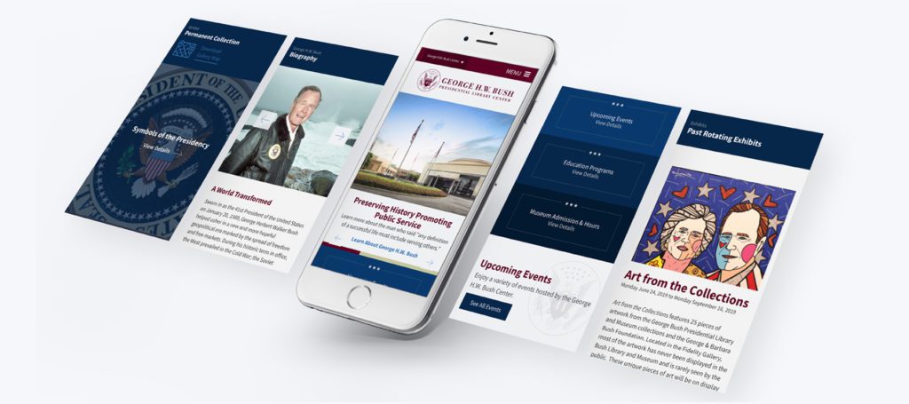
Mockups can elevate a project, but they can also break a project. For example, it can be hard to visually see the design of your web project if you only show off one screen from your project. (see above). Try pulling the design out of the mockup so that we can see the entire layout of the page. Showing multiple screens can also help show off your layouts, skills, and showing your project on multiple devices can be a huge bonus! (see below)
We know how much time and effort you put into your projects. We love polished work that looks like it was shined and tied with a pretty bow, but we also want to see what it took to get there. Does part of your project include an awesome logo design? Show us the different iterations through your sketches. Did your packaging project start out one way and then made more sense another way? Show us why you decided to go in a different route. It doesn’t have to be much, but your process shows who you are as a designer just as much as the finished product.
The review is fast paced and there isn’t enough time to show off all of your projects. After your portfolio is polished take a second to flip through your projects and choose three that are the most important to you. At the review start with those three and if there is time then you may be able to show off one or two more.
First and foremost, take a deep breath. I’ve been in your exact position and know how scary it can be to put your work out there in the open for professionals to see. If there is one thing I can promise you though, it is that most of us are not there to tear you down. This is an experience for us just as much as it is for you and we have a lot of fun doing it!
This one is big for me. I give a lot of feedback while looking through portfolios and the biggest way to unintentionally look like you don’t care is by not taking notes. The review is long and fast paced and there is no way you’ll remember every detail from the first chair you sat in if you didn’t take notes. Also, you’re there to get feedback and grow as a designer right? So grab your notebook and jot down key things that are said to you. Not only will it help you, but we appreciate you taking what we say seriously.
Present yourself like you are going into a job interview, but also let that personality of yours shine! We want to see not only what makes you a great designer, but also the type of person you are. Leaving a lasting impression goes beyond just standing out among everyone else in the room. It can land you a job offer and allow you to make a connection with a future mentor.
There are a handful of students that stood out to me last year and all of them were ones that asked me questions. If the agency you’re chatting with does something that you’re interested in, ask them about it! This is a great opportunity for you to make connections and no one is going to turn you away.
I have even had someone come back to my table towards the end of the review and pull open xd to ask me questions about the software… and I loved it!
The National Student Show and Conference is such an amazing opportunity to learn, grow, and make connections, and friendships. Take a deep breath, soak in all of the feedback you receive, and ride the inspiration train for as long as it will run. And last, but certainly not least, have fun and be yourself. You’ll shine more that way!
Gavin and I will be hanging out at the portfolio review and job fair both Friday and Saturday. We’d love to see your work and chat for a little bit! And who knows.. we might have a little something fun to give you as a job well done. Follow our team on instagram @driftcreate
Last weekend we got to see all our hard work on the Html5tx Conference come together for a pretty epic experience. The event was put together by a really rad group of people and we were lucky enough to be a part of it. We did all the branding for the conference, logo, website, t-shirts, name badges, posters, stickers and maybe some other things I’m forgetting. It was just so awesome to see everything we did working together to enhance all the little visual details of the conference. If you want to check out the work we did, here’s a link to the project in our portfolio: html5tx project.
Oh and we even presented at the conference! We did a live critique of this website: developersmackdown.com. Clark Sell, the owner of the site, was part of the panel (along with Brandon Satrom, who moderated) and Martin and I just went to town on all the things we’d change to make the site more effective. We even had a fancy PowerPoint! I think about 100 people showed up for our session. I was really nervous and one of Martin’s jokes failed big time. Everything else went pretty smoothly though.
Below is a photo of one half of the room at our session. Just before we started I asked if I could photograph everyone doing the html5 gang sign. Yes. There is an html5 gang sign.

Martin and I are wrapping up things with the first phase of the website. We still have a lot to do, but we wanted to launch and just get it out there. We’re speaking at the html5tx conference and it’s gonna be awesome. Photos of all the cool html5tx things on the way!
We have a pretty rad video on the footer of every page. You should check it out and let us know what you think. We’ll do a post on it soon also.
Time to sleep so we can dominate tomorrow.
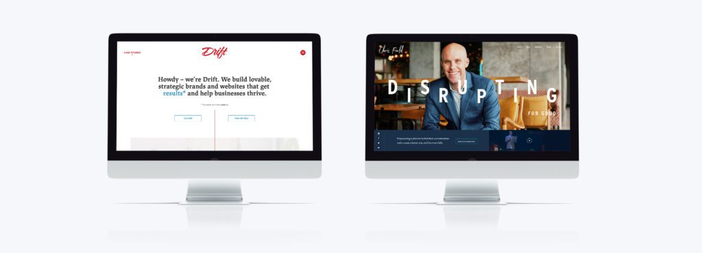
When you visit a new website, you typically have a positive or negative gut reaction about that site (re: the company’s brand). And we’re so used to browsing websites, that it’s a pretty quick reaction. In fact, we’re more critical of a website’s design, functionality, and speed, than ever before. That gut reaction plays a major role in your perception of the brand. Your perception is a response to a variety of interactions and influences, and it’s not always just the website. During a custom website design project, we do our best to create a seamless experience from a brand’s physical interface to the digital one. A consistent narrative across all channels creates customer loyalty.
What conversion means to one business may be different for another, regardless it’s usually the most important goal for a new web design. At the end of the day we’re trying to get more users, more buyers, more partners, more of something, so that our web design and branding services add value to our clients. Otherwise, what’s the point? Conversion could be adopting a new UI/UX, getting customers to add more items to their shopping cart, collecting more quality leads through a contact form, getting the “checkmark” of quality & capability from a potential partner, etc.. As we design and develop a new website, this is what guides our decisions. It’s not about creating something that just looks aesthetically beautiful. A great custom website design is about strategically creating better opportunities for conversion.
More often than not, there is a physical experience in addition to the digital experience we’re helping to create. There has to be a consistent link between the two. The digital experience is usually one of the 7-8 points of contact a customer or user needs to have with your brand before a conversion. All of these touch points must be consistent and tell the same narrative to create trust. I read a review, heard from a friend, saw an ad, visited the website, and it all made me feel warm and fuzzy. It was consistently telling me that this product or service will make my life better. And then it felt right to, call, request service, buy, submit payment, join, etc. etc. We’ve worked with That Conference for 7 years, and the work we did for them is a great example of brand consistency from digital to physical.
Your website is an opportunity for conversation. How invested in the story of your brand are your users or customers? How interested are they in what you have to say or show to them? Is your site something to be shared with friends? To be talked about over drinks?
Years ago, we created a website for a restaurant with a long history, one with many stories. We built a section of the website specifically for user submitted stories. There are now stories that span nearly five decades that can be searched, shared, and remembered. Your website is the spark for conversation. It’s a conversation between the user and the brand, but even more importantly, it can be part of a conversation between friends and colleagues. Word of mouth, from someone you trust, will always be the strongest marketing tool.
We didn’t mention SEO here, but it’s definitely a major factor. We’re currently writing about great SEO tactics for web design in 2019. In the meantime, check out some of our Examples of great B2B Website Designs
Like what you read? Let us know: hello@driftingcreatives.com
2018 has been an incredible year here at Drift. We’ve seen growth in the depth of our work with faster, mobile friendly website design, high production video, thoughtful strategic branding and lots of really cool content. The size of our team has grown! We’re now a 10 person design army. We moved to a new, bigger office. And our desire to do better and better work has continued to rocket. Our customers have seen increased leads, more brand awareness, and better conversions and that’s the biggest win of all for us. Grateful for every win this year.
We have some big things coming in 2019 and we can’t wait to share! In the meantime, here’s a look back at some of the creative work we did in 2018.
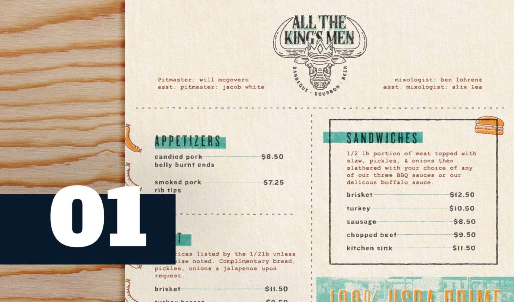
Nestled in downtown, Bryan, Tx next to the Queen Theatre, ATKM has the tastiest of all BBQ in all the land We helped develop the brand, design menus, design the interior space, showcase the beautiful cuts of meat with food photography and we helped eat lots of BBQ.
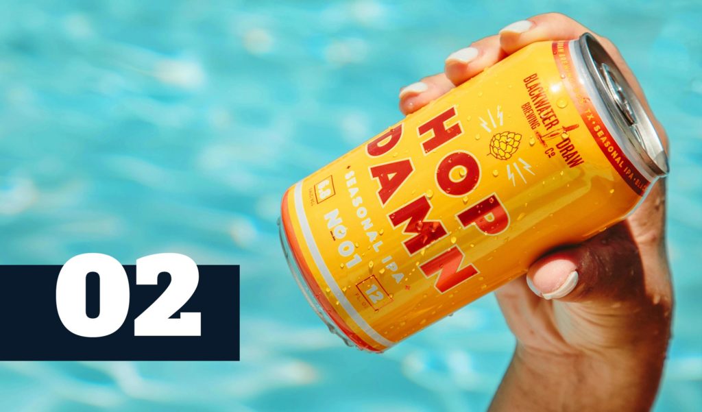
The Blackwater Draw team is awesome. We love the creative freedom and the expertise they bring to the table. Package design in the beverage industry is one of our favorites! Check out all of our can designs here.
New website design for a civil contractor doing work all over the U.S. We helped with a brand new responsive web design that more clearly captures the scale this team can handle and the outstanding safety they bring to every project. We know B2B web design and the impact of perception.
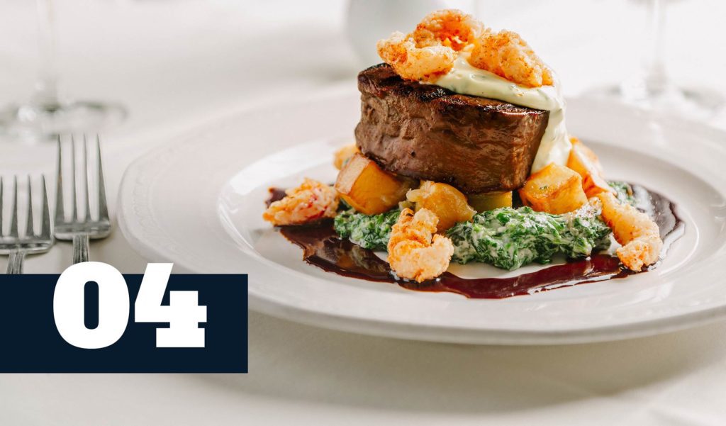
Christopher’s World Grill in Bryan, Texas is one of our favorite fine dining restaurants. We’re very lucky to help such an incredible brand with their marketing, photography, and website. Their new site launches in January! Check out their social accounts to see a sampling of their work we’ve been doing for them!
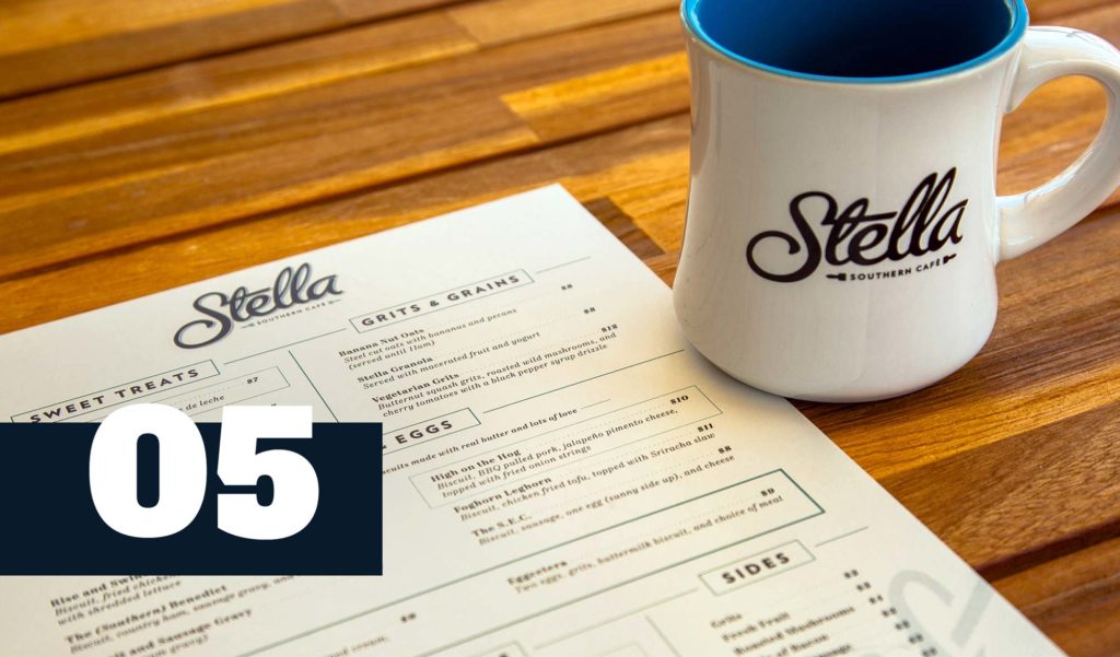
We helped launched Stella Southern Cafe this summer and took over their social marketing shortly after. We grew their following by 326% on facebook, nearly 1000% on instagram, and 700% on email. We’ve developed an evergreen campaign that fosters active user generated content (based on our #stellamugshots campaign) and strong engagement across their social channels.
We’re very, very excited about this fella. It’s a web application and mobile application. It’s awesome. And we’re launching Summer 2019. Very. Very. Excited. Did we say that already?
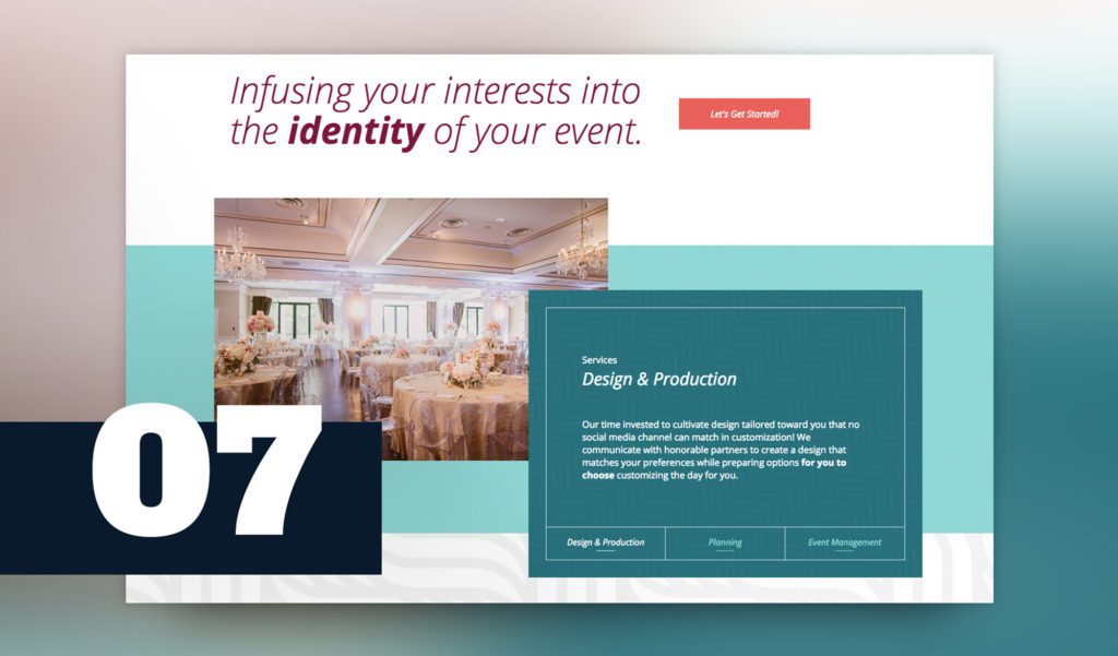
Event Identity is a fantastic wedding planning provider in Houston, TX. We built a new, ultra modern, responsive website that’s very out of the box (container). Check it out!
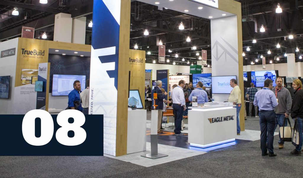
A trade show booth is one of the most interactive forms of design. And we love designing for the experience. We designed this trade show booth for Eagle Metal, created all the graphics, developed on-brand messaging, designed print collateral and produced video content to top everything off. Delighted to hear about their successful trade show!
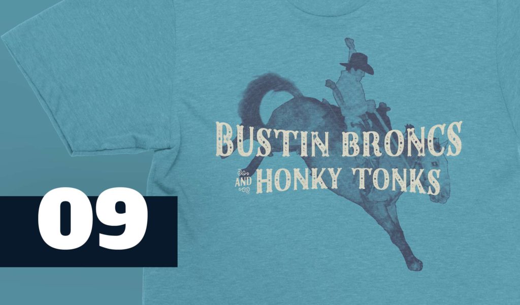
This man is one of a kind. He talks a big game about riding bulls. He’s the best at everything, even if he’s only tried it once. Pow Pow. On to the next one. Ridin’ Bulls and Punchin’ Fools. We love working with Dale and helping to come up with his next great t-shirt design.
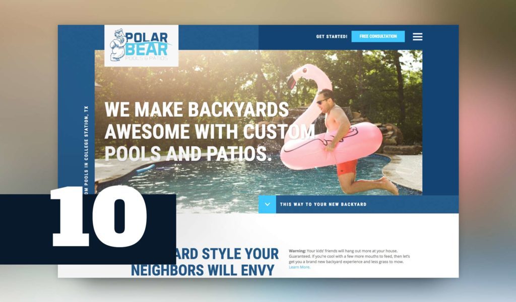
The awesome crew at Polar Bear Pools let us truly showcase their brand with a brand new website and photos to really help showcase their personality. They make backyards awesome with custom pools and patios. And they really want to do great work for their customers. When business owners talk passionately about what they do, and the WHY behind it all – we get tingles and it makes us better designers. Check out the website!
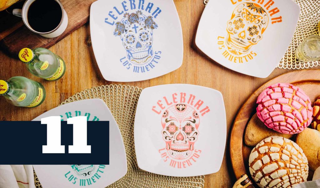
This illustration project had us diving into traditional Mexican culture and finding ways to spin the aesthetics in new ways, suitable for this elegant dinnerware boutique. Check out all the illustrations here!
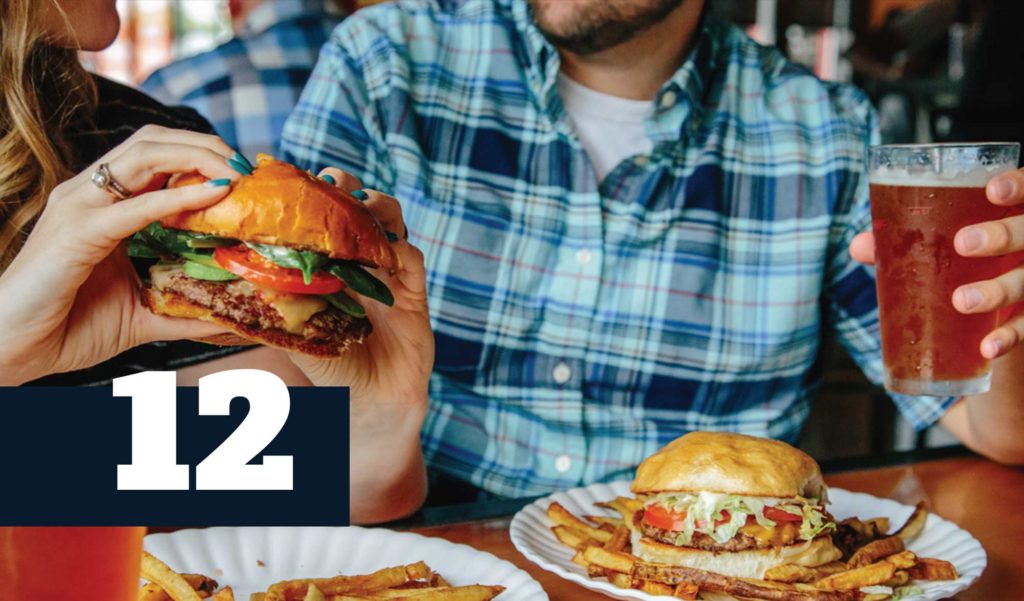
We love working with restaurant brands and helping showcase their personalities online. Creating content people actually want on their social feed is what we do. And trust us, people want these bangin’ burgers on their feed. Yes, please. #getinmybelly
We’re always trying to learn new things. It’s one of our very important core values. Sometimes we like to share those things on our social channels. We post most of this kind of work on our Instagram, so if you’re not following us, come check us out!
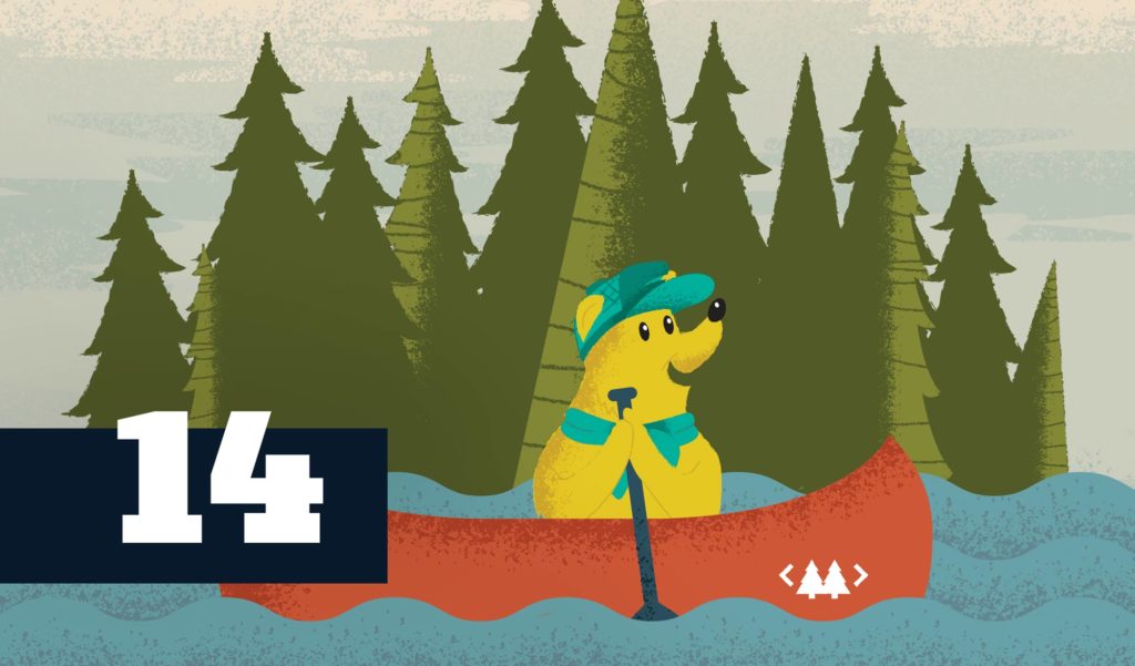
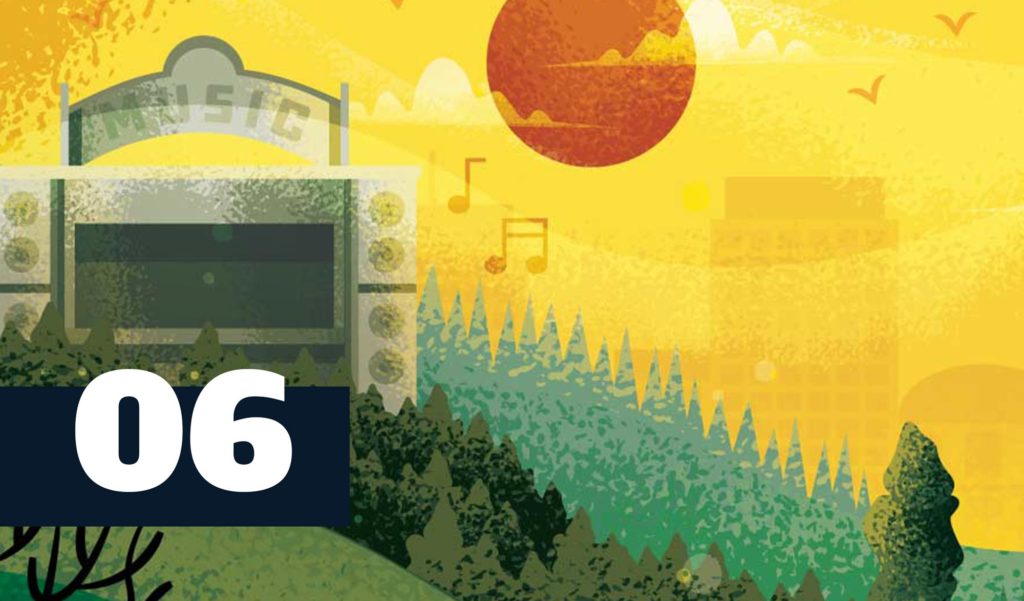
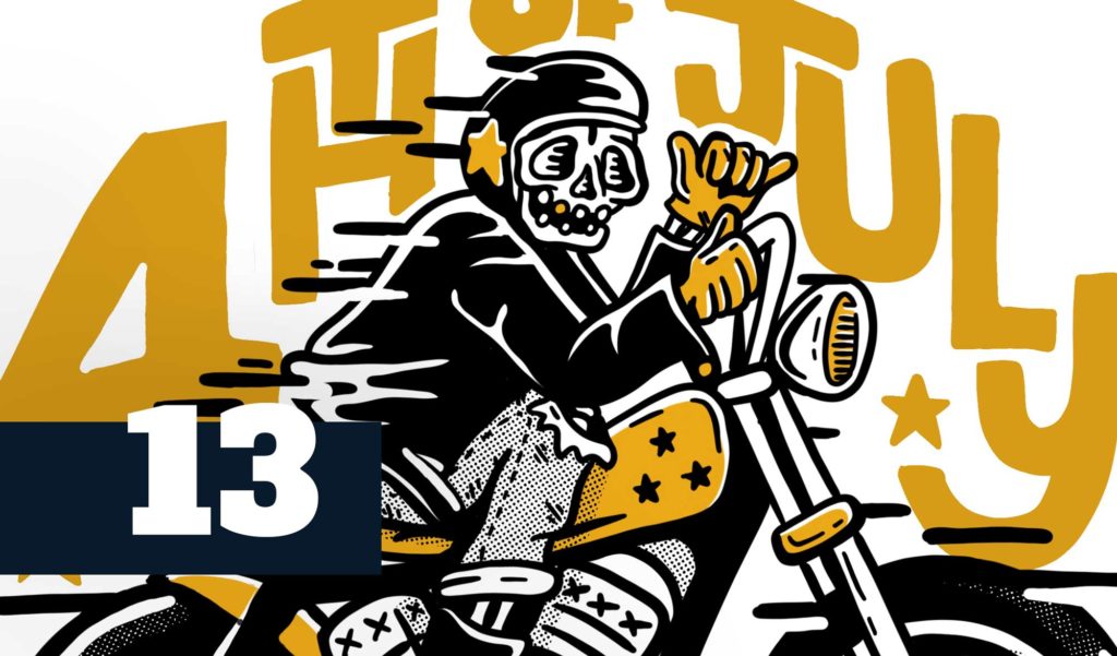
We love crafting experiences for conferences. That Conference is a tech conference at a giant indoor water park in Wisconsin. Take a look around the work we’ve done and you’ll instantly feel at home and ready to hang out with this crew. It’s low key, packed full of amazing content, and more summer camp than traditional tech conference.
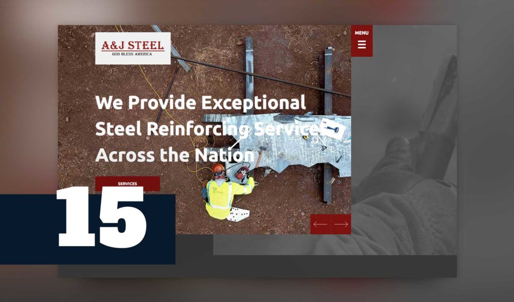
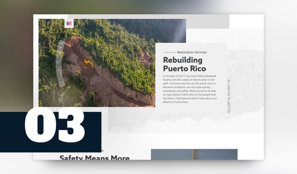
We built a brand new responsive WordPress website for A&J Steel that creates a perception more in line with who this brand is today. They’re a national steel reinforcing company that recently helped with the rebuilding in Puerto Rico. We love getting to push the envelope with our b2b construction industry customers.
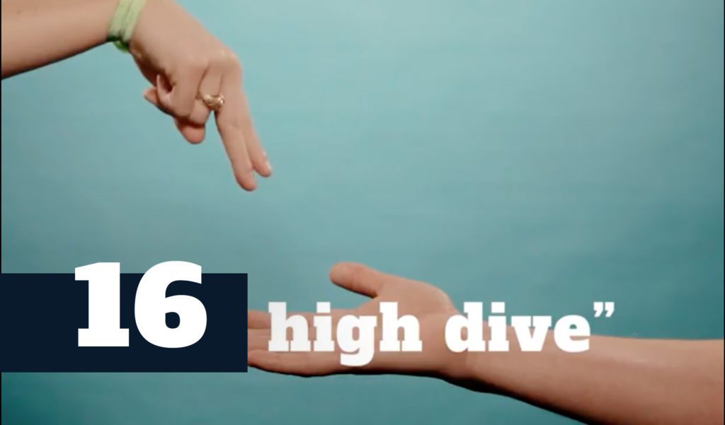
One of the greatest self-initiated projects we’ve ever put together. The whole team came together to make this high-five day epic. Check out the video!
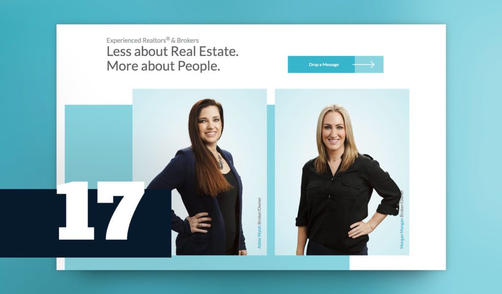
The Walsh & Mangan team is authentic, ready to serve, thoughtful, and the team is packed with experienced real estate agents. This crew is truly motivated by their customers’ successes. We were honored to help show that personality off in their new website.
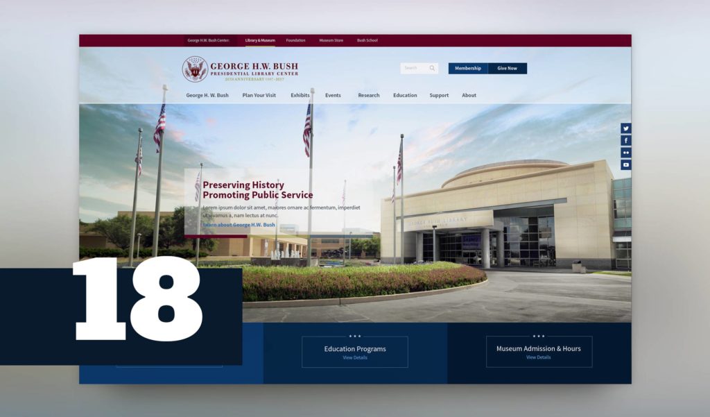
Designing the George H. W. Bush Library website was an incredible honor. It’s even more impactful with the former president’s recent passing. To know we’ve played a tiny role in preserving his legacy through the library and foundation website is something we’ll always cherish! Once in a lifetime experience!
Mid-South Synergy has trusted us over the last few years to help build out their new website, create all kinds of printed collateral, video, branding, and strategic direction. The Mid-South team has some visionary leadership and we’re lucky to be involved with their growing brand.
Malek is constantly making innovations in home automation and ways to improve heating and cooling efficiency. We’re looking forward to a growing partnership and the work we’ll be doing for them in 2019!
One of our clients had their logo chainsawed out of a solid piece of cedar. Yowza!

A good logo is simple enough that it can look great in all types of execution all while being uniquely different and memorable. We make logos that can can be chainsawed out of wood. Booyah. Take a look at some of our other awesome logo designs here.
Here’s what the brute logo looks like usually. And if you’re looking for a sweet cooler that keeps ice for five days. Check ’em out here: bruteoutdoors.com
![]()
We’ve had another one of our logo designs branded onto a pig. No joke.

Check out more of our branding work for That Conference here.